Creating a Value Calculator for Financial Decision-Making
Building a business case at Visa meant pulling together dense financial models, inputs scattered across spreadsheets and email threads, and calculations that had to be redone by hand any time an assumption changed. Teams could usually get to a number, but explaining how they got there, and trusting it enough to bring in front of a client, was the harder part. I designed a value calculator that turned that process into a guided, step-by-step experience for building a business case, validating it, and presenting the result with confidence.
Overview
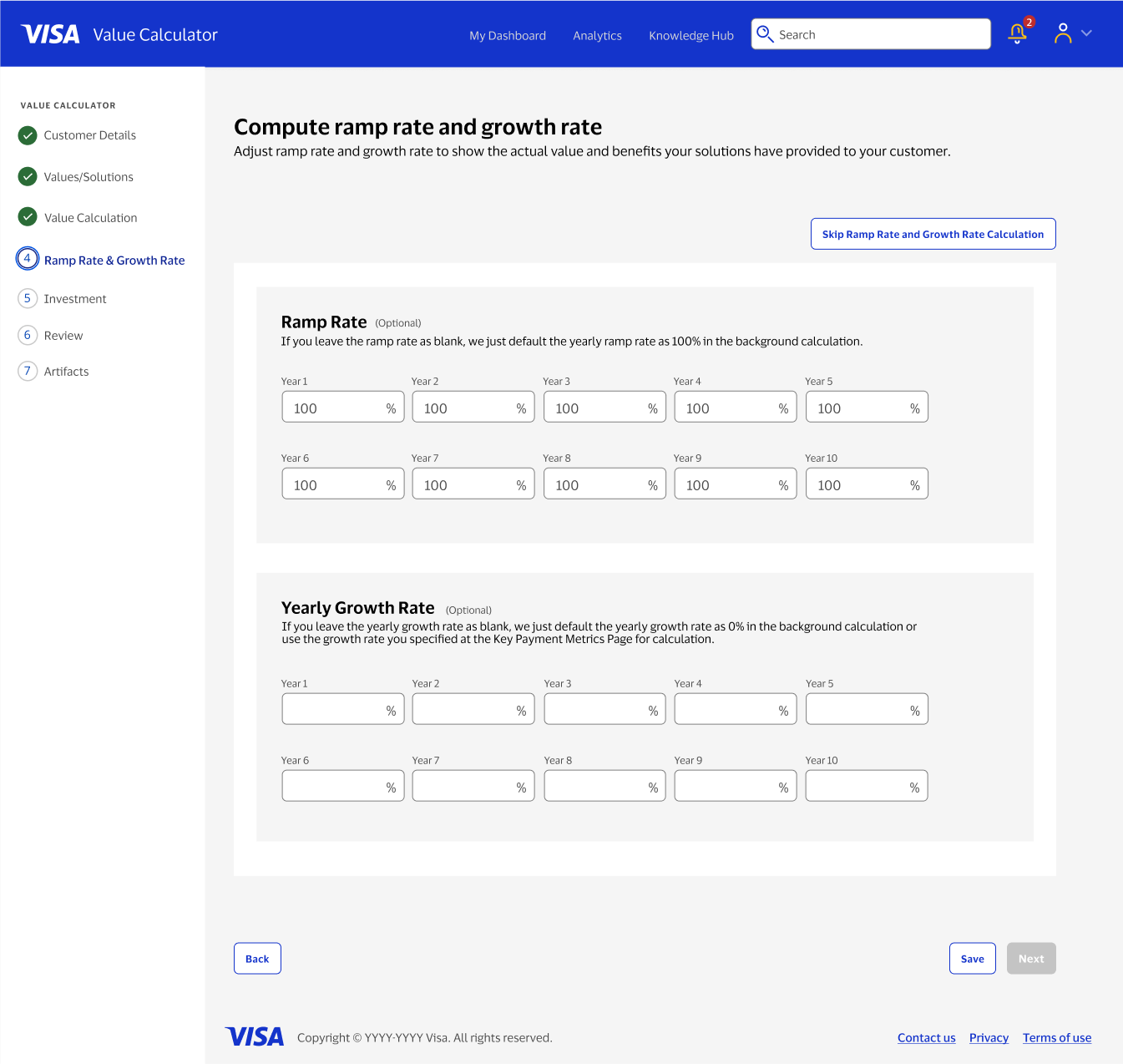
The ask came out of a real gap: there was no existing tool or interaction model for building a business case at Visa. Teams were assembling financial models by hand, in whatever format worked for them that week, which meant no consistency in how value was calculated or communicated, and no way to reuse or validate the work later. This project set out to build that tool from the ground up, taking financial logic that lived in people's heads and spreadsheets and turning it into something structured enough to guide a first-time user and flexible enough to hold the different ways teams actually approach a business case.
My role
As the lead UX designer, I owned the end-to-end design of the value calculator, from concept to delivery. I worked closely with product and engineering to define the structure of the experience and to translate financial logic that was genuinely complex into a step-by-step flow that didn't require a finance background to follow. I partnered with stakeholders across the business to align on how value should be modeled and presented, since that turned out to be as much a negotiation as a design problem, and I worked with UX research throughout to validate that the experience held up for users with very different levels of financial expertise.
The problem
{{ item }}
Key decisions in the experience
The flow had to hold multiple paths at once without confusing anyone in a single one of them.
Two entry points instead of one flow
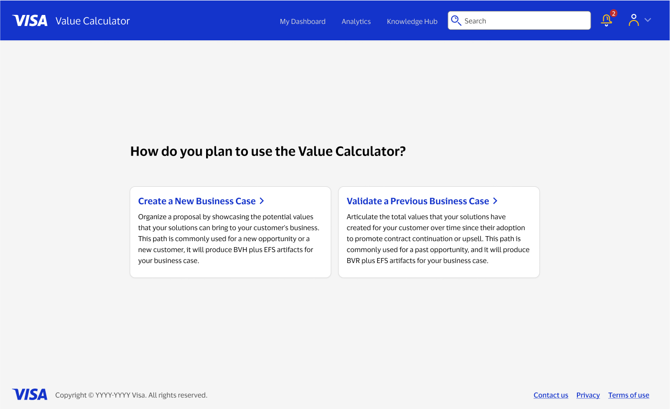
Early on, it was tempting to design a single linear flow and force every use case through it. Instead, I split the experience into two clear starting points, creating a new business case from scratch, or validating and refining one already underway, so people could orient themselves immediately based on what they actually came to do.
A flow that reveals complexity gradually
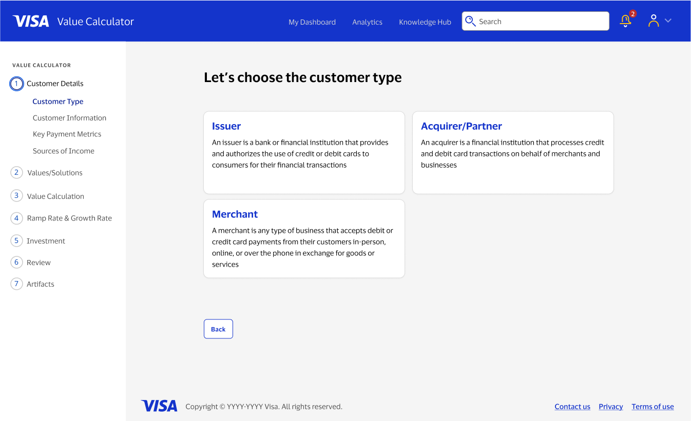
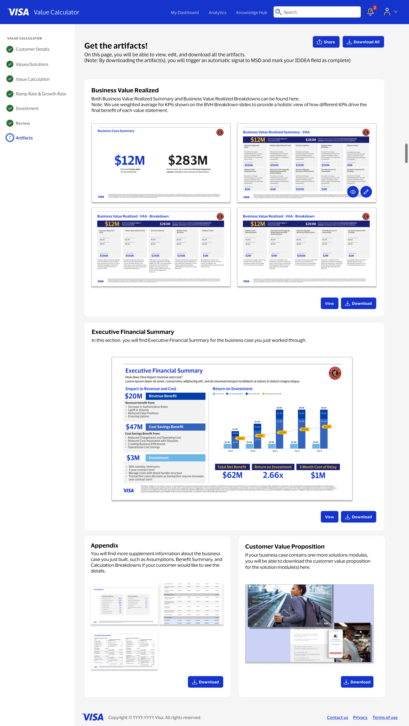
The underlying model had a lot of moving parts: customer details, value drivers, calculations, investment assumptions, and more. Rather than surface all of that at once, I broke the experience into a sequence of steps, each focused on one part of the decision, so someone new to the tool could move through dense financial inputs without losing track of where they were or what still needed their attention.
Grouping inputs the way people actually think about them
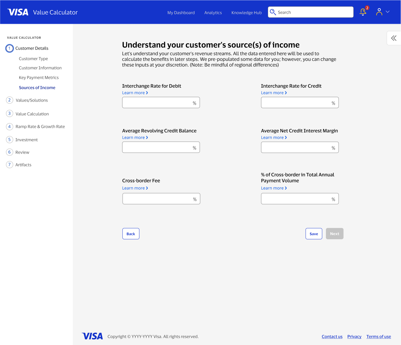
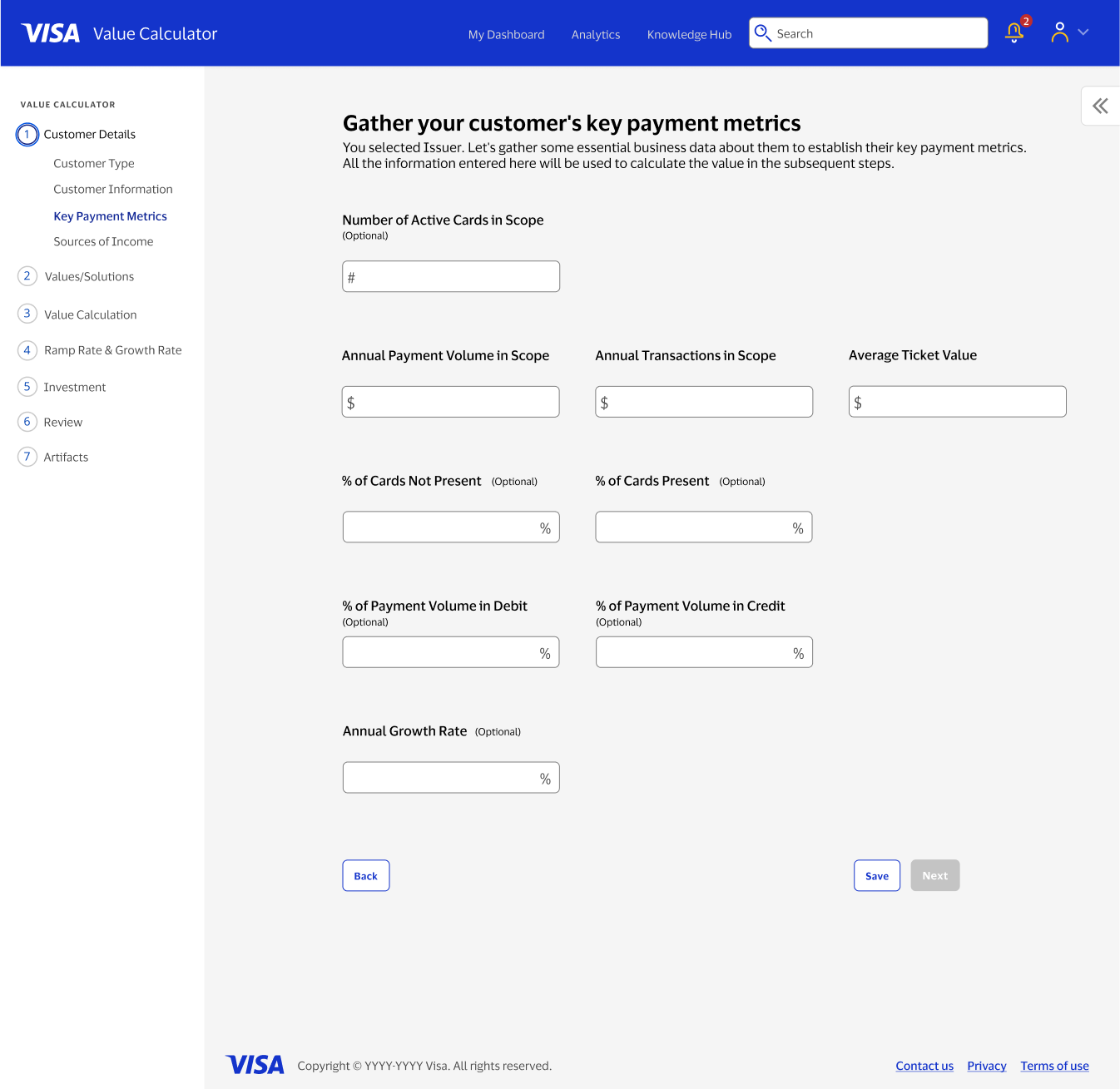
Financial inputs like payment volume, transaction mix, and revenue drivers don't mean much in isolation, and listing them as a flat form would have made the tool feel like a spreadsheet with extra steps. I grouped related inputs into sections that matched how someone building a business case would naturally reason through the numbers, so entering data felt closer to a conversation than a form.
Room for more than one way of thinking about value
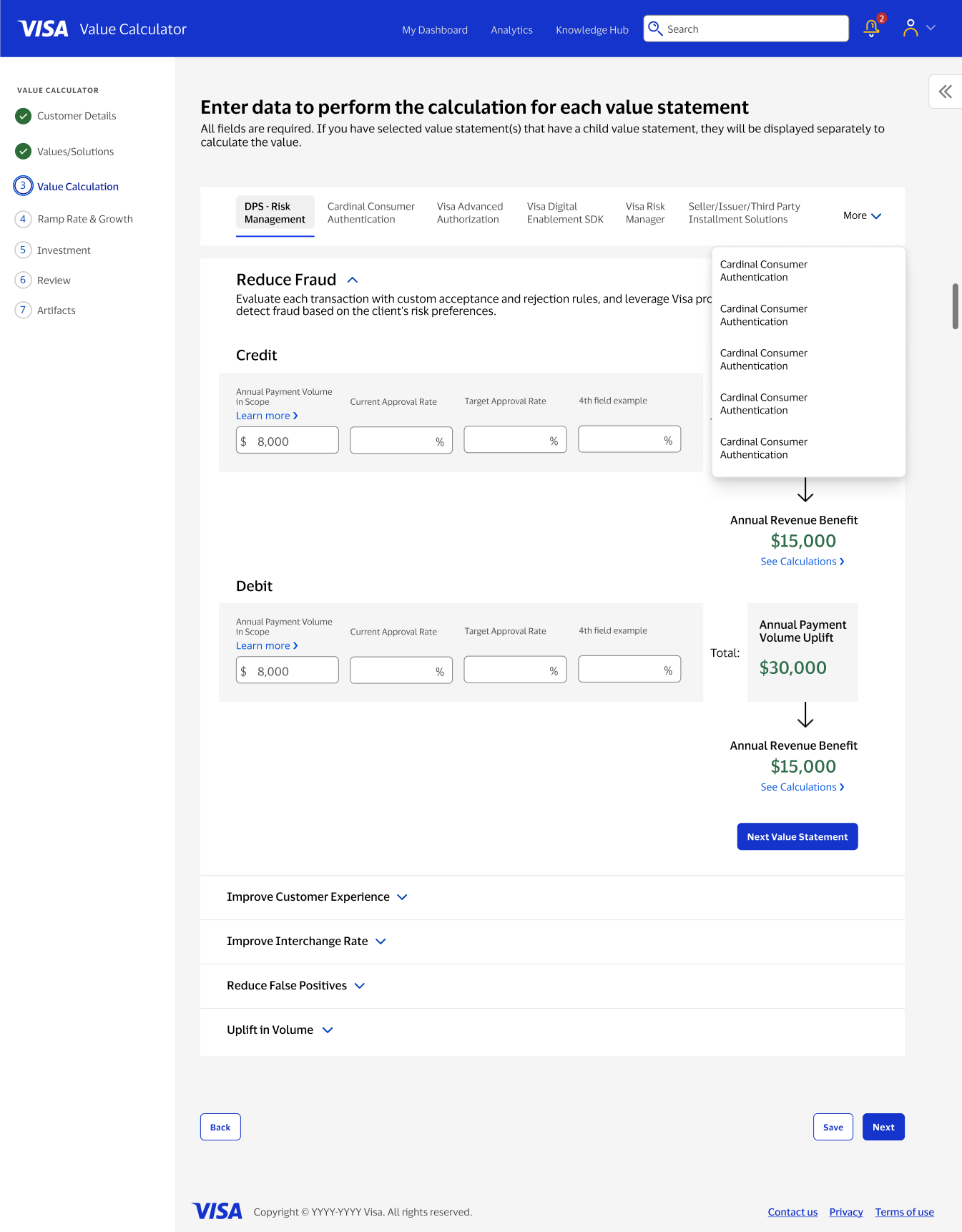
Different teams approached a business case differently: some started from a value statement they wanted to prove out, others started from a specific product or solution they were pricing. Rather than pick one mental model and force everyone into it, I designed flexible pathways that let users start from either direction and still land on the same structured calculation underneath.
Inputs connected to outcomes
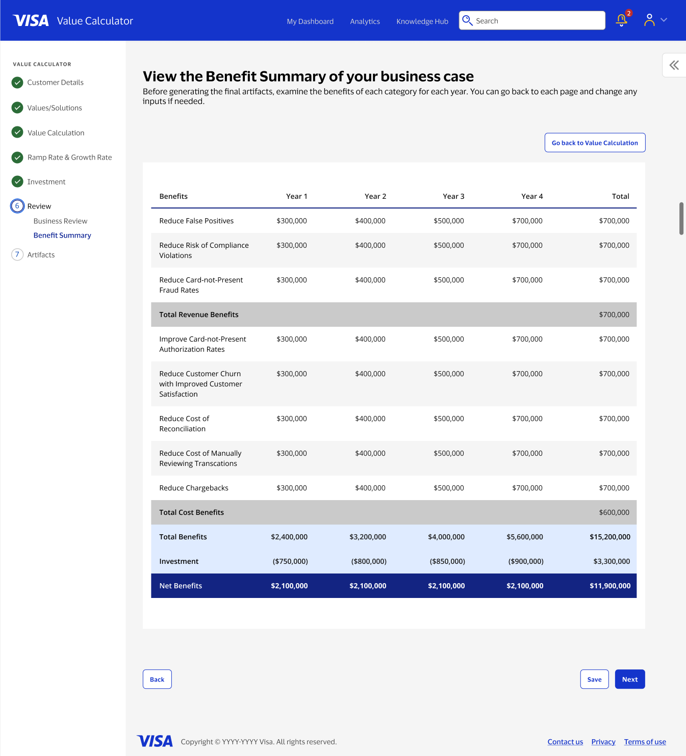
Structured the calculation view to clearly show how inputs translate into outputs, helping users understand and communicate the resulting value.
What made this hard
{{ c.title }}
{{ c.body }}
Where it landed
The value calculator replaced a process that had lived in scattered spreadsheets and individual habits with something structured and repeatable. Teams could build a business case the same way regardless of who was doing it, which mattered as much for consistency as it did for speed.
It also changed what a business case conversation looked like in practice. Instead of presenting a final number and hoping it held up under questions, teams could walk through exactly how they got there, which made the whole exercise easier to trust, easier to defend, and easier to build on for future decision-support tools on the platform.