Designing a Centralized Onboarding Hub for Financial Products
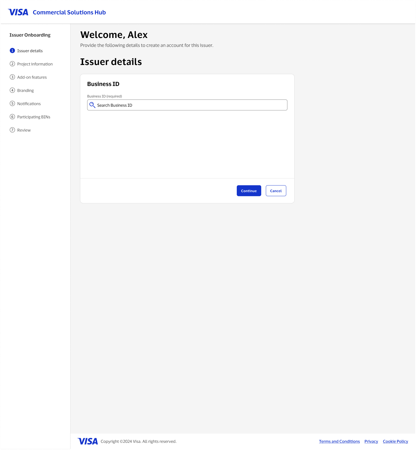
There was no existing product here. Onboarding an issuer onto Visa's Commercial Solutions Hub meant filling out a stack of separate Word and Excel forms, each with its own layout and its own owner. I designed a net-new, structured onboarding flow that replaced that stack of documents with a single seven-step wizard, taking an admin from a business ID search to a fully configured, branded, BIN-enrolled issuer account.
Overview
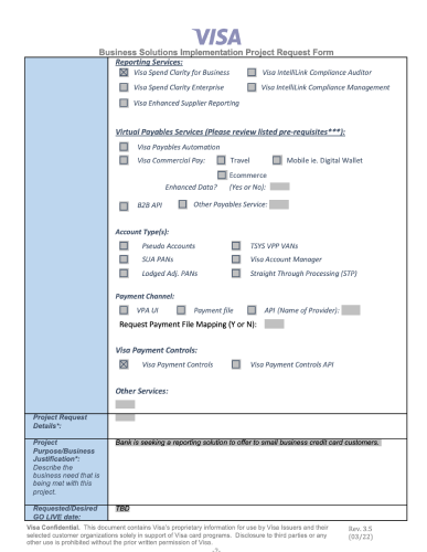
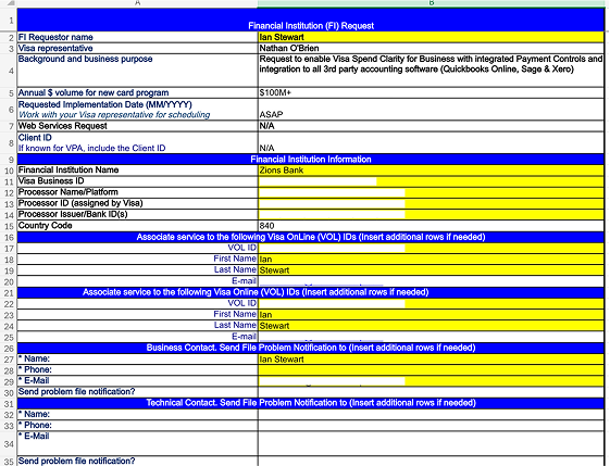
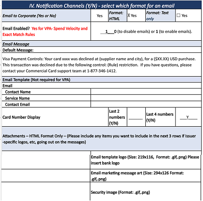
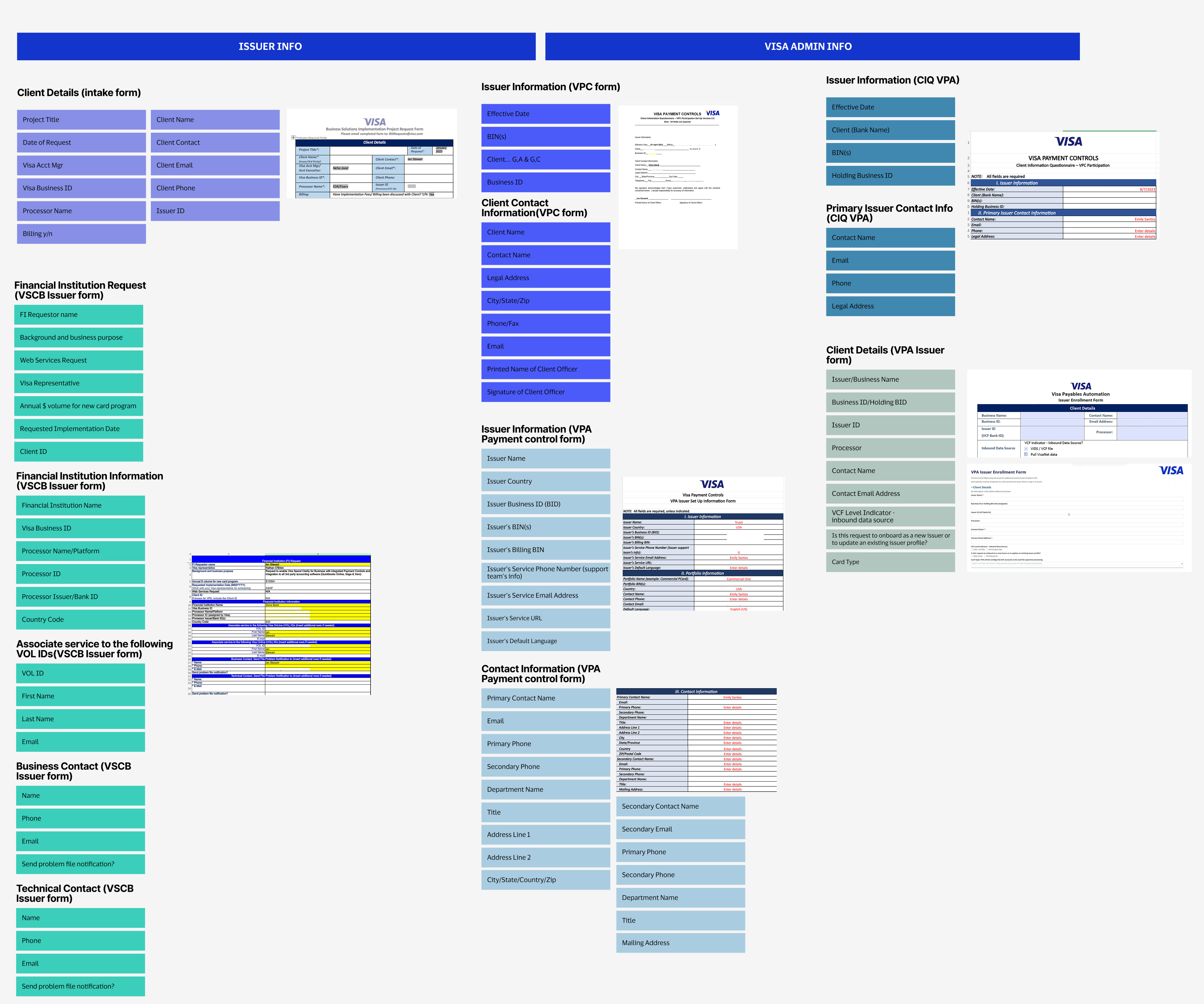
Before this project, there was no onboarding product at all, just a stack of legacy forms: a Business Solutions Implementation Project Request form, a Financial Institution Request spreadsheet, a VPC Issuer form, a VPA Issuer Enrollment form, a Notification Channels spreadsheet, and more. Each had its own layout, its own required fields, and its own owner, and the same piece of information, an issuer's name, its BIN, its contact details, could show up worded differently across three or four of them. This project set out to replace all of that with one connected onboarding flow, built from the ground up, that could hold everything those old forms were collecting inside a single guided UI.
My role
I led the design of the onboarding flow end to end. Before any screen design started, I went through every legacy form line by line, pulling out each field, and grouping them by what they actually represented, client details, portfolio and project info, implementation type, notification preferences, BIN data, so the team could see the real shape of the data model hiding underneath years of disconnected paperwork. I partnered closely with research as they interviewed the internal users living with the old process, then led a two-day workshop with stakeholders to pin down exactly what needed to be in the new flow and what didn't. From there I worked with engineering to define how conditional fields and add-on features should branch, and with product and customer success to figure out what was actually required at each step versus what could stay optional.
The problem
{{ item }}
A stack of forms, not a product
This is what onboarding an issuer looked like before: a project request form, a financial institution spreadsheet, a notification channels spreadsheet, each collected and processed by hand.
Key decisions in the experience
Most of the design work was deciding what to show, to whom, and when.
Reverse-engineering the old forms
Before I could design anything, I had to know what data actually existed. I went through every legacy form and spreadsheet, pulled out every field, and color-coded each one by what kind of input it was, required, optional, pre-populated, or view-only, then grouped them into categories like client details, portfolio info, implementation type, and notification channels. That map became the actual blueprint for the wizard's structure.
A seven-step wizard instead of one long form
Onboarding an issuer touches business verification, project scope, feature selection, branding, notifications, and BIN enrollment. Rather than one long form, I broke it into seven discrete steps with a persistent progress rail, so an admin always knew where they were and could save and return without losing work.
Conditional complexity, revealed only when needed
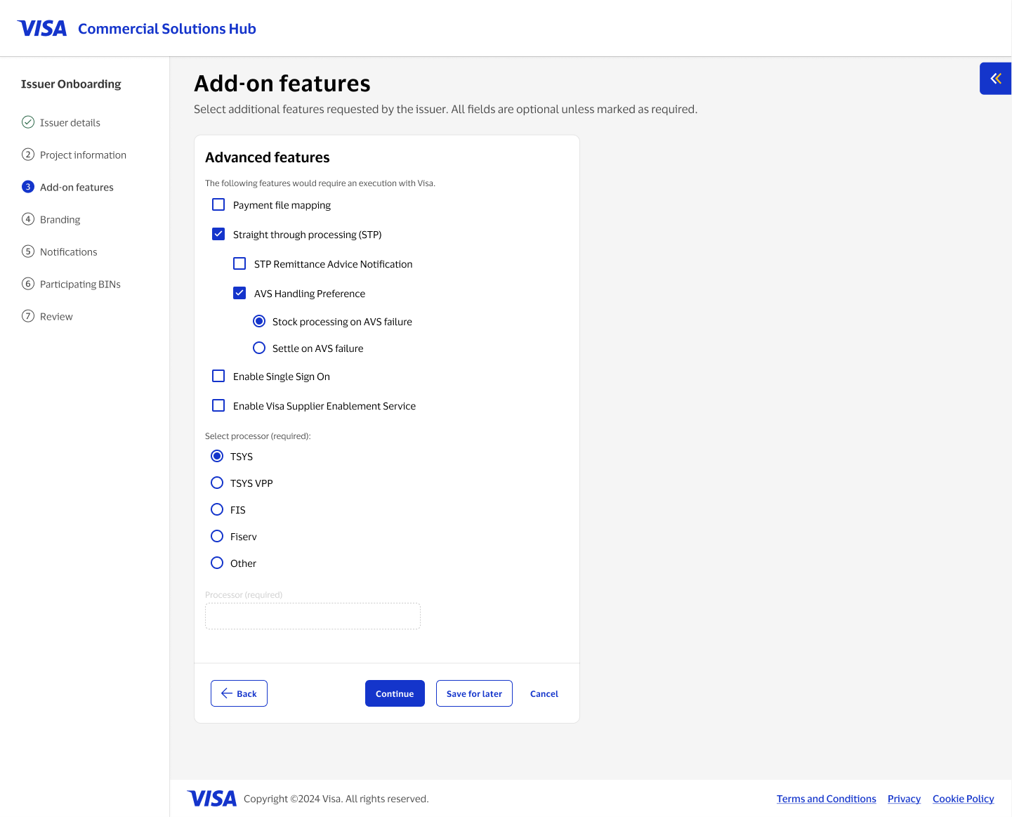
Add-on features could branch three levels deep: a feature like straight-through processing could reveal its own sub-options, which could reveal their own configuration choices. I designed the nesting so each layer only appeared once its parent was selected, keeping the default view short for issuers who didn't need the advanced features.
Co-branding you can see before you commit
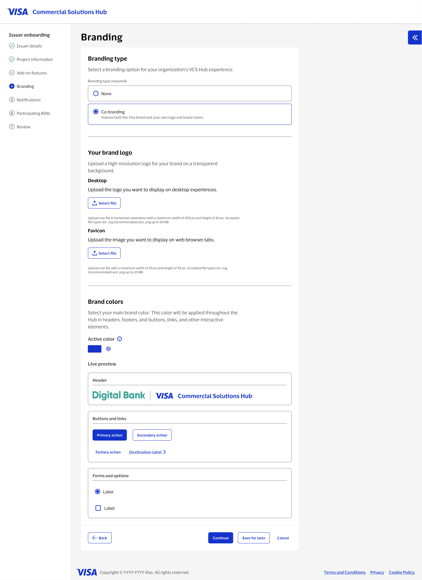
Issuers could co-brand their instance of the hub with their own logo and color, applied across headers, buttons, and form controls. Rather than have someone guess how a brand color would read across the product, I built a live preview into the branding step so the effect was visible immediately, before they moved on.
Granular controls without a cluttered default
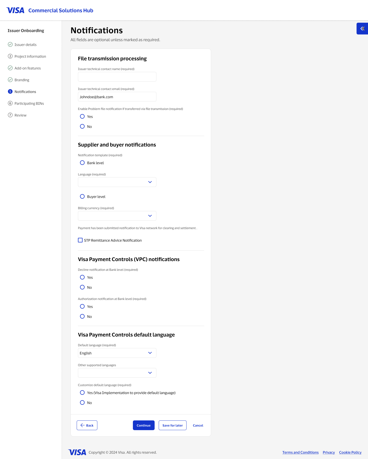
Notification preferences needed to support bank-level and buyer-level templates, multiple languages, and separate rules for declines and authorizations. I grouped these into clearly labeled subsections so the page read as a set of related decisions rather than one long list of settings.
Managing BINs at scale
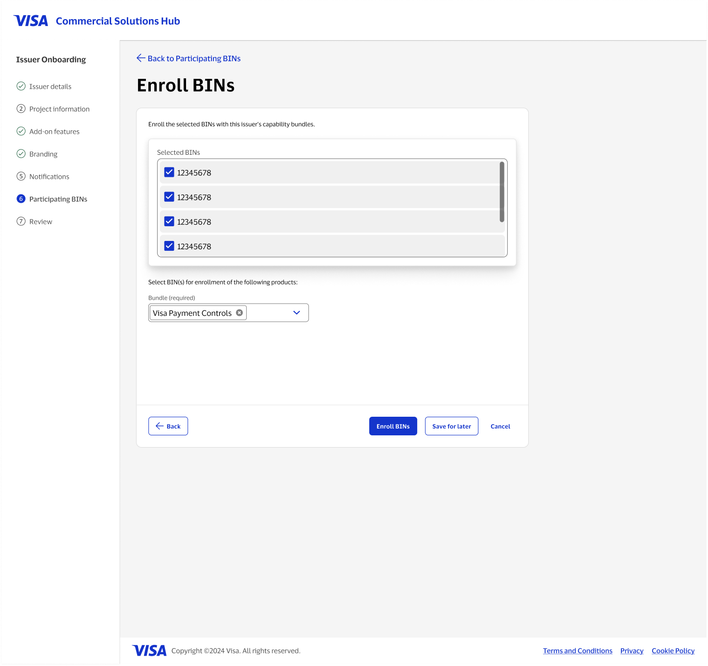
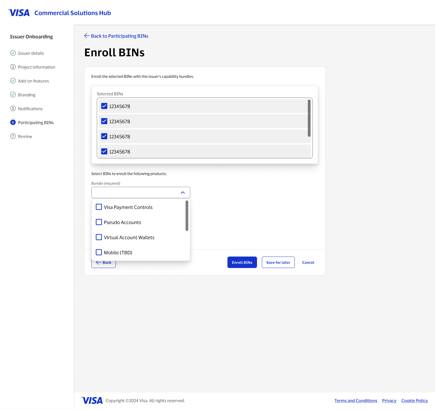
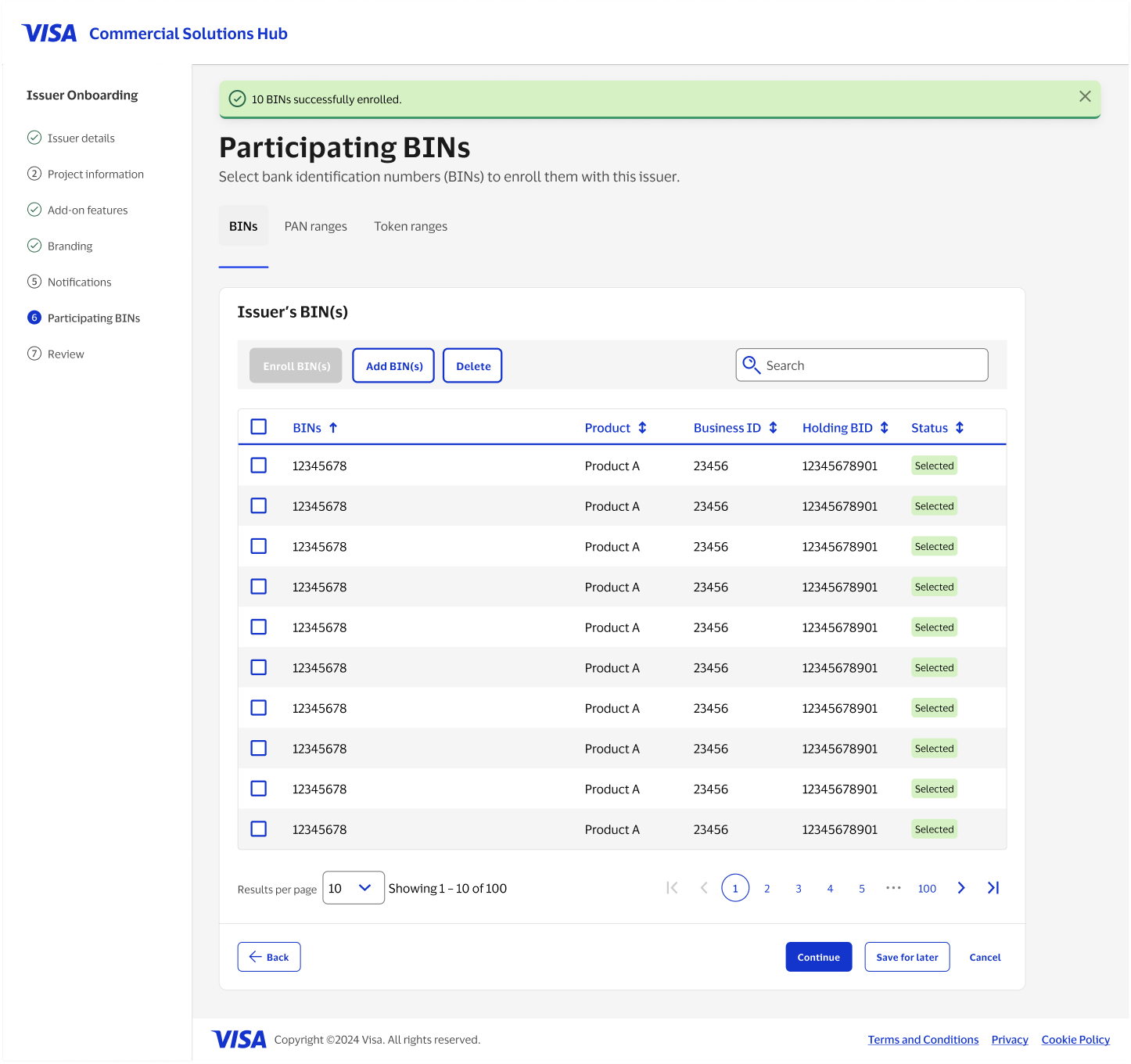
Some issuers needed to enroll a handful of BINs, others needed hundreds. I designed a table with bulk select, search, and pagination as the default view, with a manual entry or file-upload path for adding new BINs and a bundle picker for enrolling many at once, so both the careful, one-by-one case and the fast, bulk case felt native to the same screen.
Confirmation that closes the loop
After a bulk action like enrolling a batch of BINs, the table reflected the change immediately and a clear success message confirmed exactly what happened, so an admin never had to wonder whether an action they just took actually went through.
What made this hard
{{ c.title }}
{{ c.body }}
Where it landed
The onboarding hub replaced a process that had lived across emails, spreadsheets, and one-off setup steps with a single guided flow. An admin could take an issuer from a business ID search to a fully branded, BIN-enrolled account without leaving the tool once.
It also gave the team a structure that could hold future complexity. New add-on features, new bundles, and new bulk actions could be added inside the same seven-step frame instead of requiring a new one-off process every time the product grew.