Designing Moneta: From AI Prototype to Production-Ready Screens
Currencycloud's treasury function manages FX trading, currency positions, liquidity, and hedging across a mix of external banking platforms, with no purpose-built workspace of its own. I'm designing Moneta, a net-new internal system for that team, working directly with product owners in a space with no existing screens or established patterns to build from. I used Replit's AI to get working concepts in front of stakeholders fast enough to earn buy-in on direction, then used Claude, fed into a Figma plugin, to turn that direction into screens built to Visa's design system.
.png)
Overview
This was a net-new experience with no existing product to redesign. Before it, Currencycloud's treasury team handled FX trading, currency exposure, liquidity, and hedging by working across a mix of external banking tools not built for how the team actually operates. Moneta is a net-new internal workspace that brings money movement approvals, FX trades and hedges, and settlement tracking into one purpose-built system.
This case study is really about process. I used AI two different ways on this project: fast and rough to get stakeholders bought into a direction, then precise and on-brand to produce screens that actually match Visa's design system.
My role
I'm the lead designer on Moneta, working alongside two other designers, and I'm the one accountable for the timeline and for how closely our work tracks what product actually needs next. That meant running the working sessions, keeping the information architecture and the two other designers' screens consistent with each other, and staying close enough to product owners that scope changes surfaced in a planning conversation rather than in a design review. I also pushed on questions the team hadn't settled yet, for example where Moneta should actually sit within the broader Back Office ecosystem, and made sure we validated that thinking with the right stakeholders before letting design work scale on top of an unconfirmed assumption. I used Replit's AI tools to generate working concept prototypes I could put in front of the team almost immediately, giving everyone something concrete to react to and helping surface disagreements about scope early, while the direction was still cheap to change.
Mapping the system
Before any screen got designed, we needed to agree on what Moneta was actually structured around.
Grouping capabilities into journeys, not just a feature list
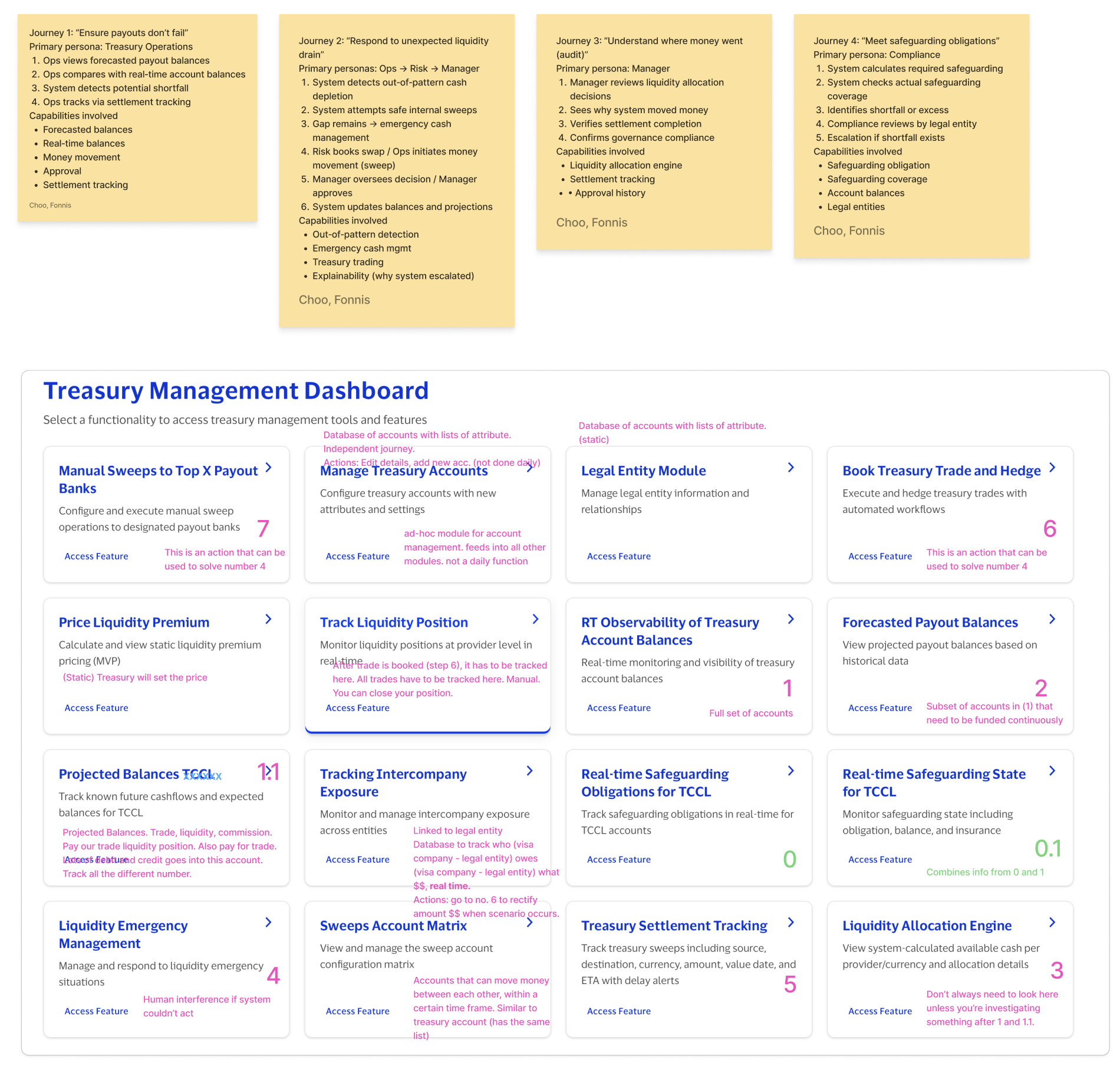
Once the zones were roughed in, the two other designers and I broke the underlying capabilities into four journeys, each tied to a specific persona and a specific job: treasury ops ensuring payouts don't fail, ops/risk/manager responding to an unexpected liquidity drain, a manager auditing where money went, and compliance confirming safeguarding obligations are met. Every capability on the resulting Treasury Management Dashboard traces back to one of those journeys, which is what let us catalog close to twenty distinct features without the page turning into an undifferentiated list.
Tracing journeys through to the actual screen sequence
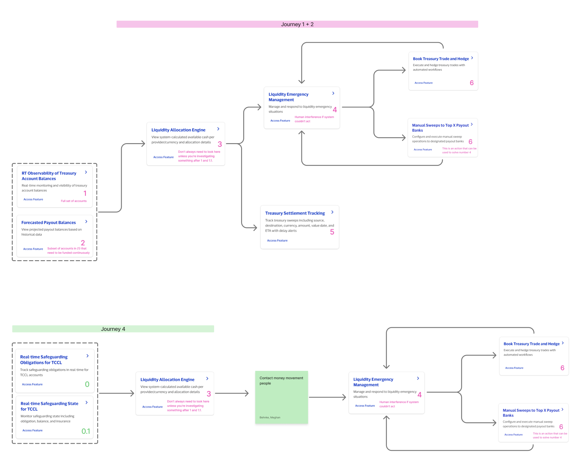
The journeys only matter if they hold up as a real sequence of screens, so we diagrammed each one as a flow: which feature a user lands on first, what triggers the next one, and where a manual intervention has to interrupt an otherwise automated path. Product reviewed these directly and challenged the sequencing, in one case asking whether Treasury Settlement Tracking and Track Liquidity Position were actually different things or the same capability described twice, which sent us back to tighten the definitions before we treated them as separate features.
A structural hypothesis, stated plainly and left open to challenge
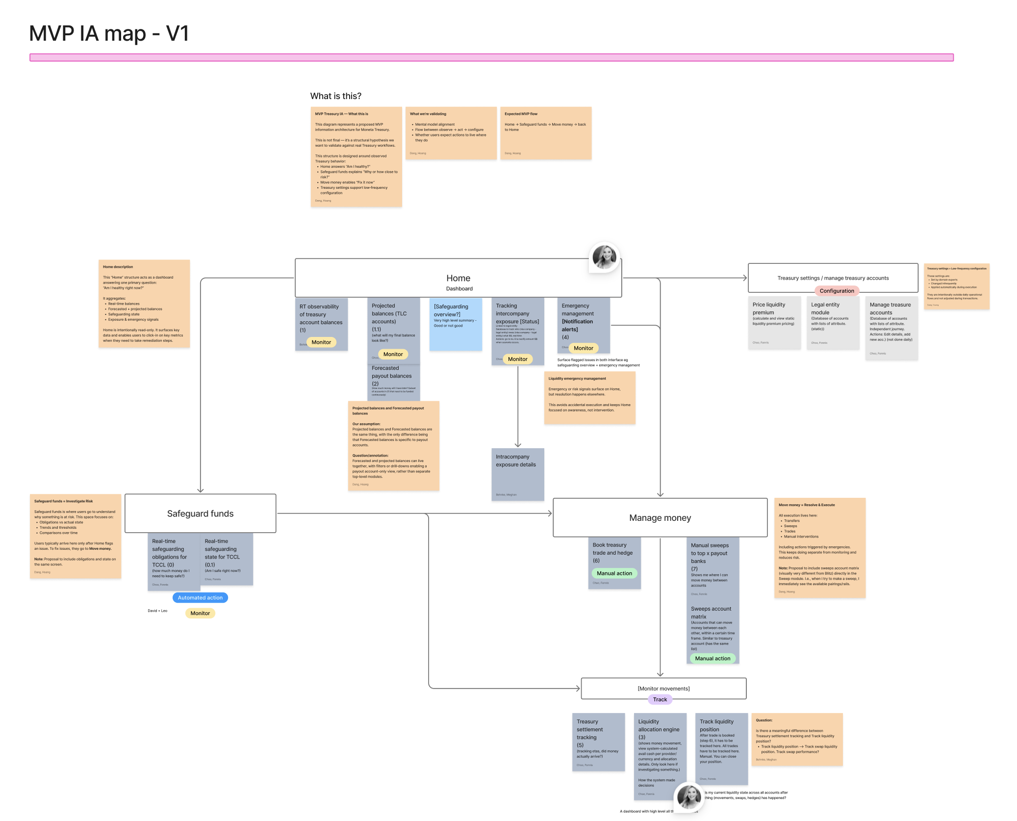
The first IA map split the product into four zones built around observed treasury behavior: Home answers "am I healthy right now," Safeguard funds explains why something is at risk, Manage money is where anything actually gets resolved and executed, and Treasury settings holds the low-frequency configuration nobody touches daily. I labeled it explicitly as a hypothesis, not a final structure, and used it to validate two things with product: whether the mental model matched how they actually think about the flow from observing a problem to acting on it, and whether they expected actions to live where we'd placed them.
Putting product stakeholders inside the lo-fi frames themselves
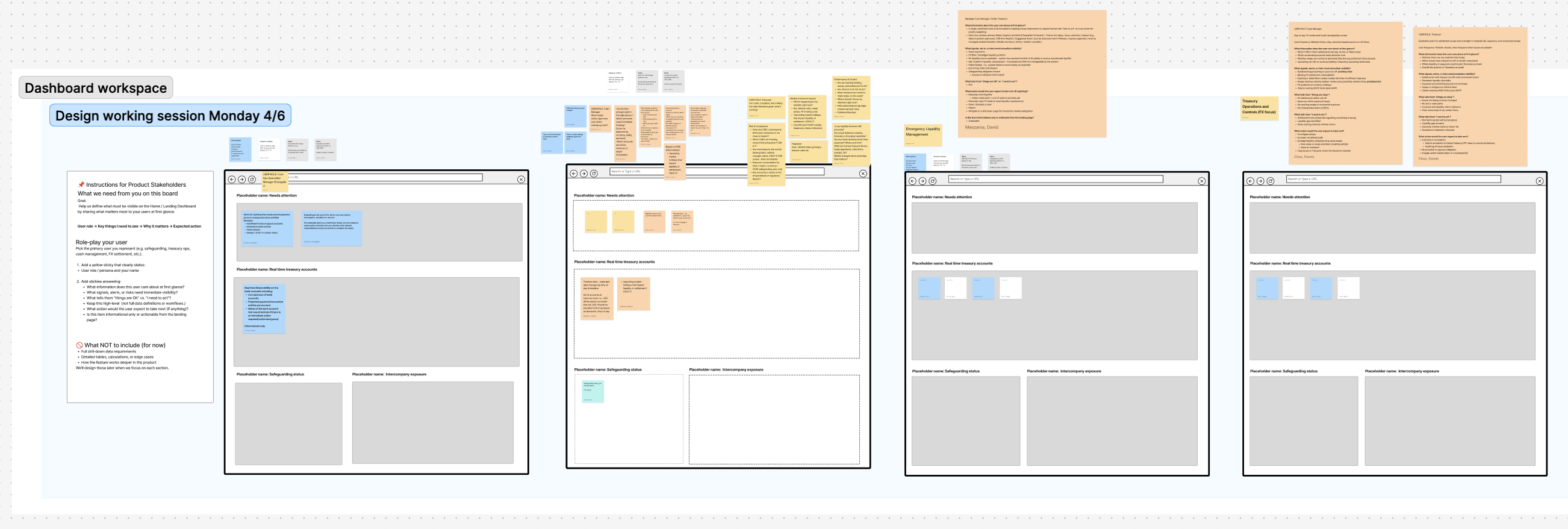
To settle what belonged on the home dashboard, I ran a working session where I asked product stakeholders to role-play the persona they represented, treasury ops, safeguarding, cash management, or FX settlement, and answer a fixed set of questions directly inside placeholder browser frames: what they'd need to see at a glance, what tells them something is fine versus something needs action, and what they'd expect to do next. They left their answers as yellow and blue stickies right inside the frames rather than in a separate document, which meant the placement of every dashboard module traced back to a specific stakeholder's own words instead of a designer's guess.
The problem
{{ item }}
Key decisions in the experience
There was no prior product, no user base to interview, and no established pattern for a treasury workspace like this to lean on. Rather than wait for requirements to firm up, I used Replit's AI to generate working concept screens for three core workflows, fast enough to put a real, clickable direction in front of product owners within days and let the conversation happen around something concrete instead of a blank page.
Money movement approvals, made visible
Every transfer request needed a clear approve/reject path, with the operational impact of that decision, balances, settlement rail, liquidity effect, visible before anyone signed off. The concept surfaces pending requests, settlement alerts, and a full audit trail so a decision never had to be made blind.
.png)
.png)
FX trades and hedges, with context attached
A swap or hedge is only understandable next to why it exists. The concept ties every trade to the exposure it addresses and the liquidity position it changes, and carries a trade through its full lifecycle, quote, approval, execution, so a trader is never looking at a number with no story behind it.
.png)
.png)
Settlement tracking that explains itself
Automated sweeps mostly need no attention at all, but the ones that break need a clear reason, not just a red status. The concept shows every movement's lifecycle live, and when one stalls, explains exactly which policy blocked it and what the resolution options are.
.png)
.png)
.png)
AI got us to a real conversation, not a real answer
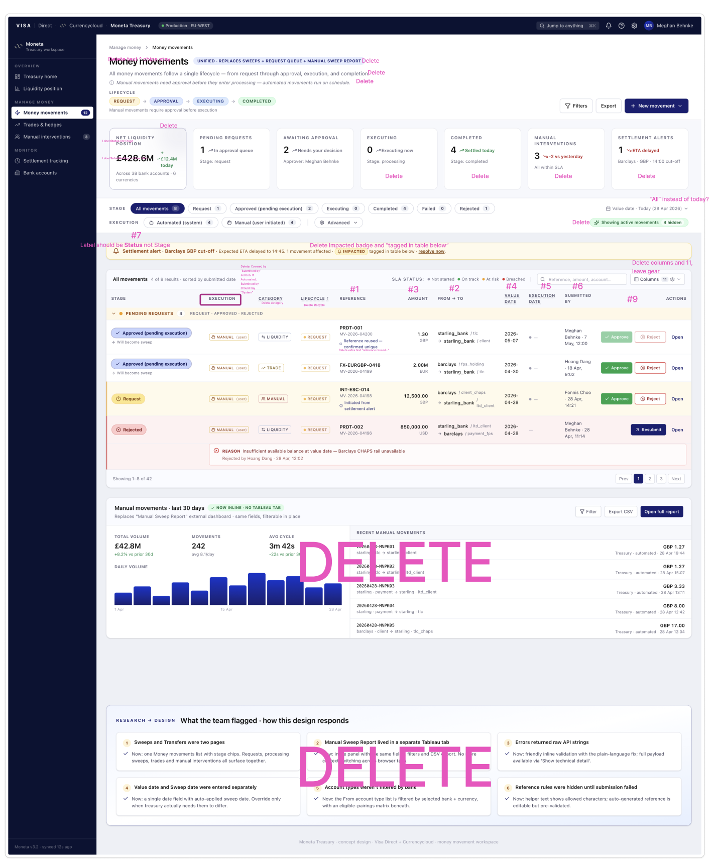
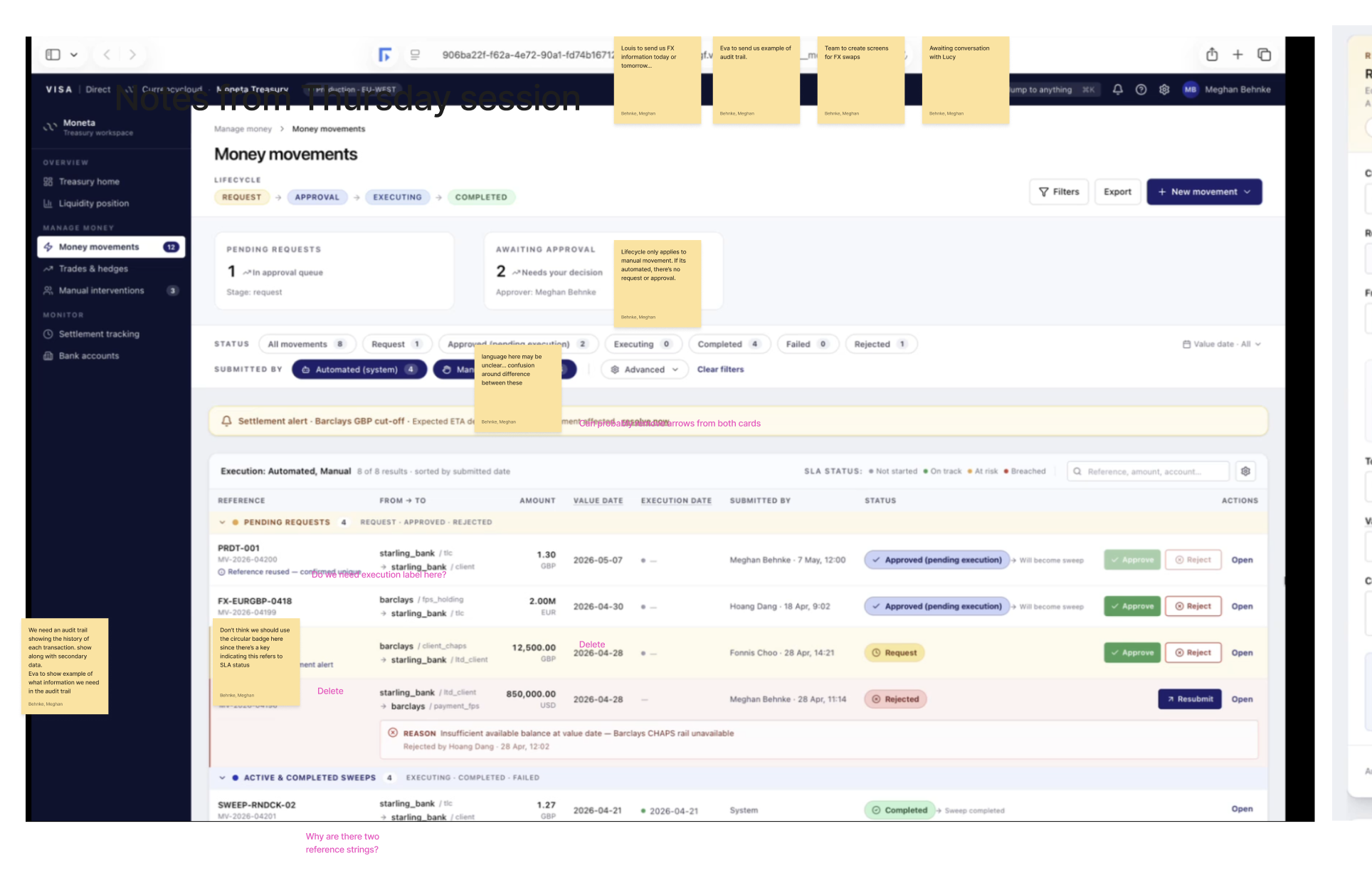
Once Replit produced a working first pass of the money movements screen, product and design sat down with it together and marked up exactly what didn't hold up: sweeps and transfers were split across two pages that should have been one, the manual sweep report lived in a separate Tableau tab instead of inline, errors surfaced as raw API strings instead of plain language, value date and sweep date were entered as two separate fields when they should have been one with an override, account types weren't filtered by the bank selected, and reference validation rules stayed hidden until a submission already failed. None of that is something the AI was going to catch on its own; it took the team's domain knowledge of how treasury operators actually work to find it.
Once product owners were aligned on direction, the work shifted to production. I fed the agreed concepts into Claude, then used a Figma plugin to turn that output into real screens built entirely from Visa and Currencycloud's own back-office design system components, not an approximation of it.
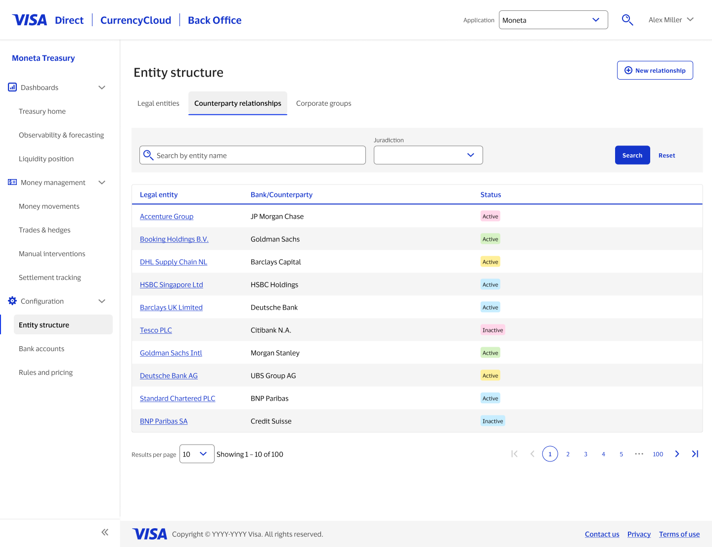
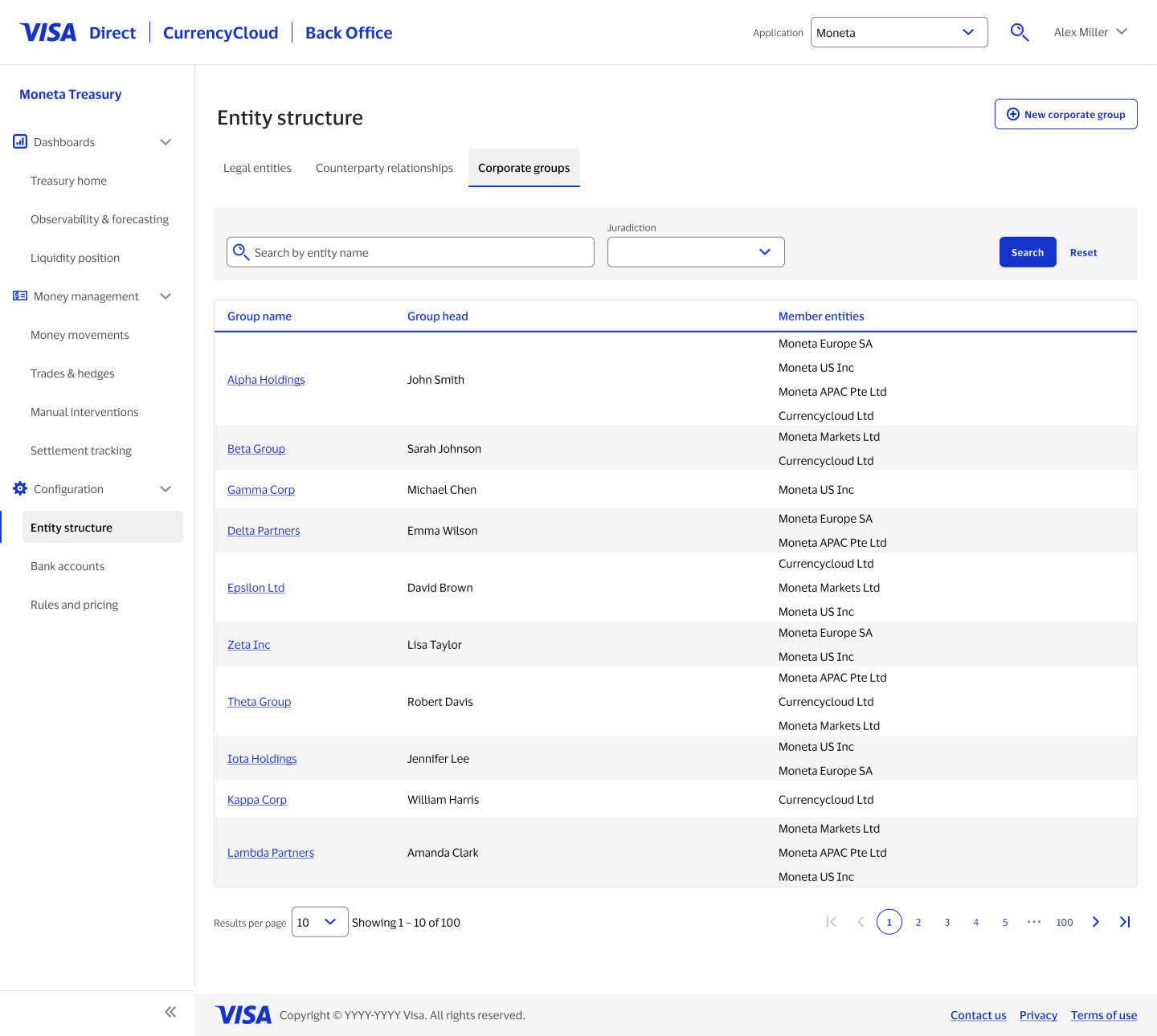
Entity structure as three connected views, not one dumping ground
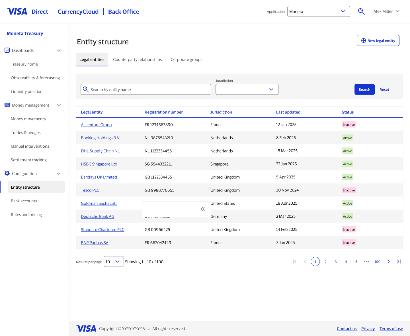
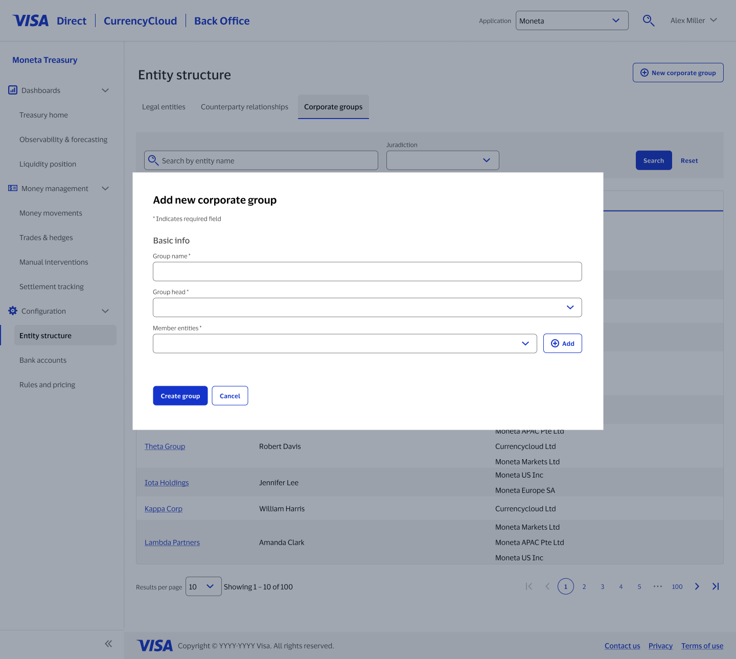
Legal entities, counterparty relationships, and corporate groups are really the same underlying structure looked at three ways. Rather than one dense table with every column at once, each got its own tab, its own filters, and its own purpose, while still living under one "Entity structure" page.
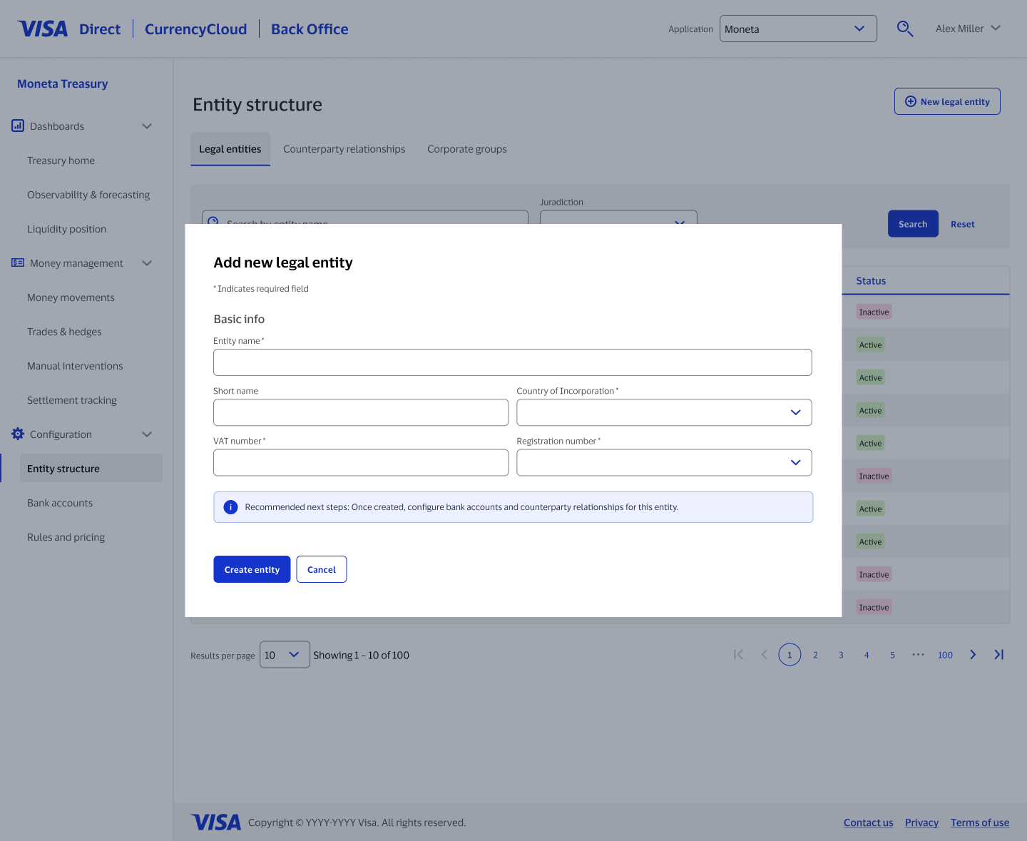
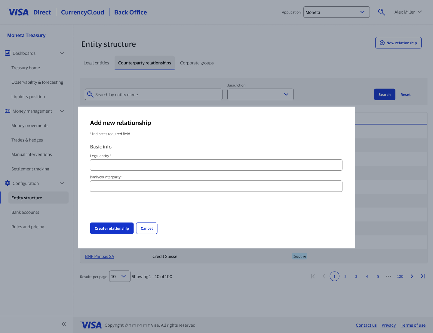
A purpose-built form for every creation flow
Adding a legal entity, a counterparty relationship, and a corporate group all involve different fields and different logic. Instead of one generic "add" modal reused everywhere, each got a form scoped to exactly what it needed, built from the same underlying components so they still felt like one system.
Bank accounts that carry the operational detail treasury needs
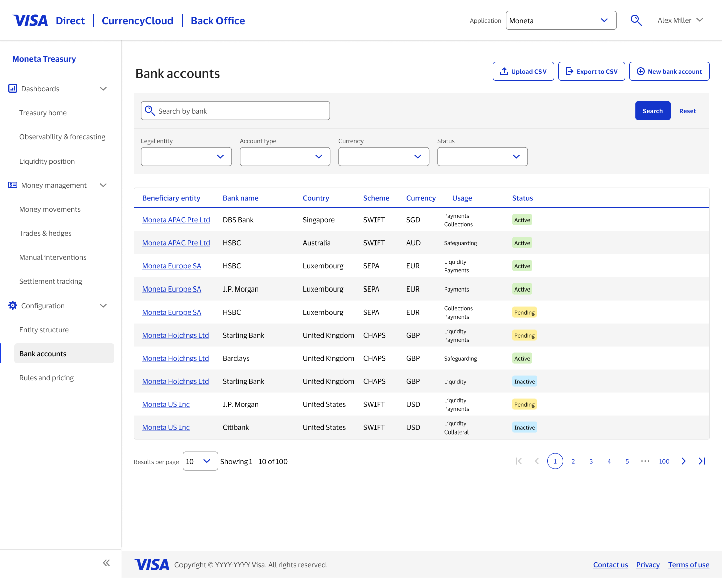
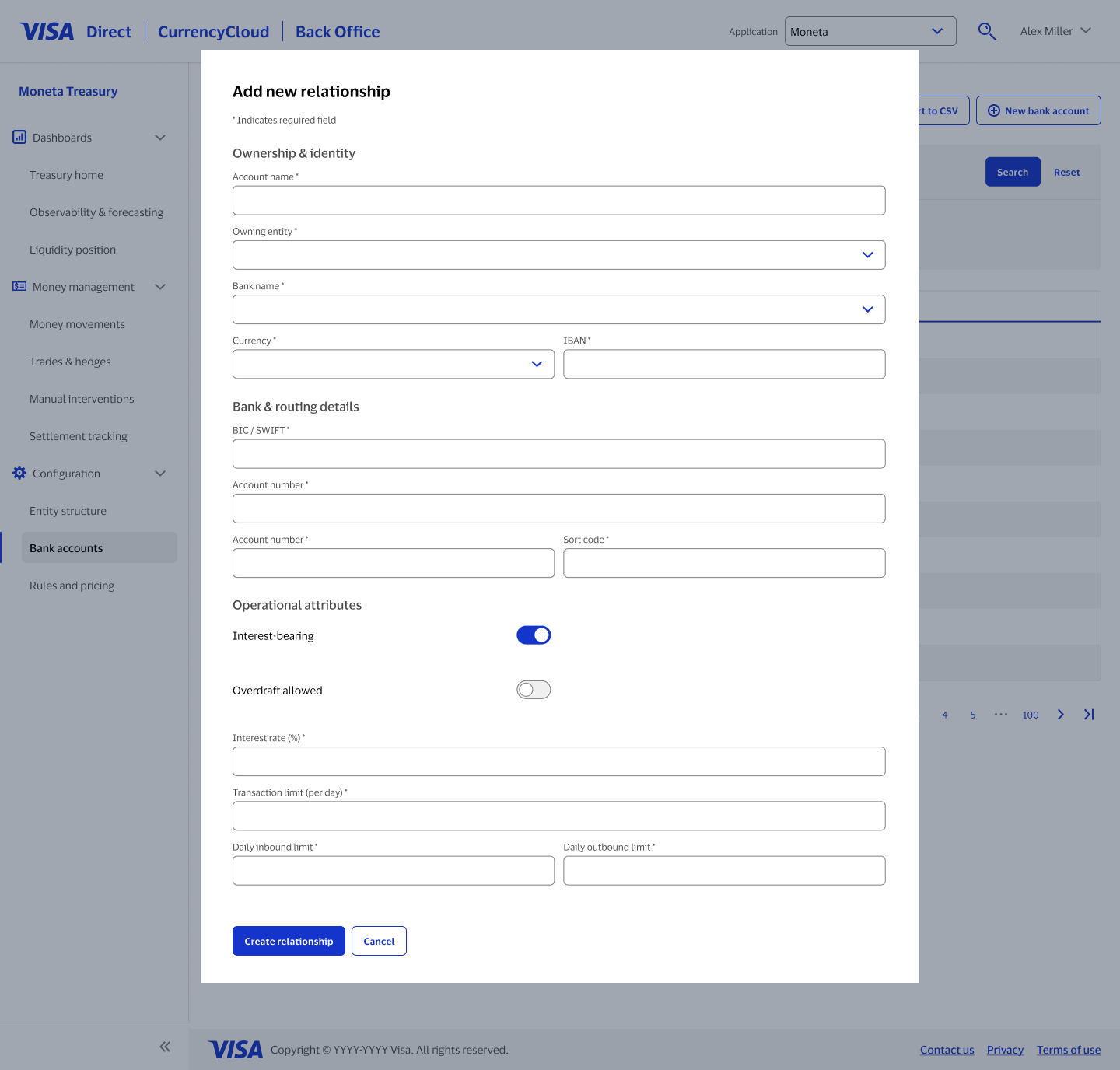
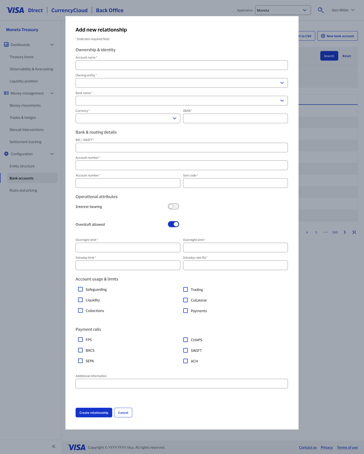
A bank account here isn't just a name and a number. Depending on how it's used, it needs interest terms, overdraft limits, usage categories, and payment rails. The form reveals exactly the fields relevant to what's toggled on, so someone configuring a simple safeguarding account isn't stuck scrolling past overdraft settings they'll never touch.
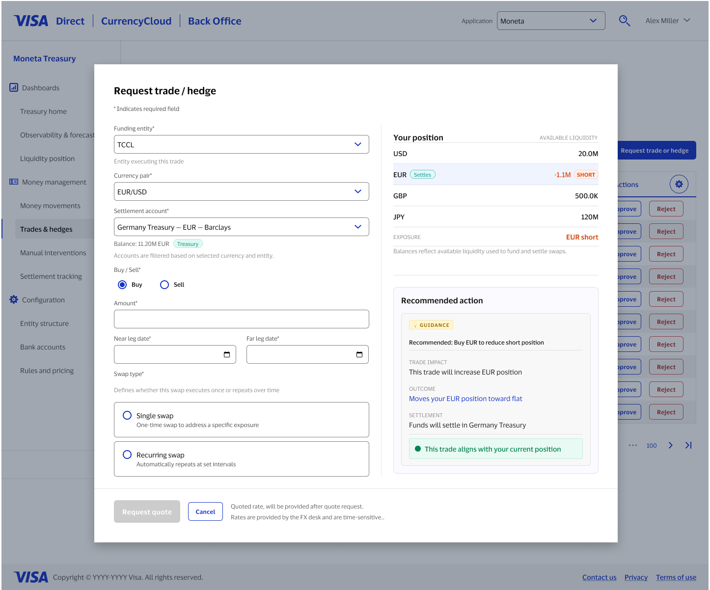
A trade request that helps you decide, not just collects data
Requesting a trade or hedge sits right next to a live view of the entity's position and a recommended action, so someone filling out the form can see how the trade they're about to request would actually move their exposure before they submit it.