Improving Mobile Product Usability Through Structured User Research
I led a moderated usability study on the SensiWatch Platform mobile app, a shipment-monitoring tool from Sensitech, to find out where the interface broke down for real users. The study turned scattered impressions of "the app is confusing" into four specific, measured problem areas and a prioritized set of design recommendations.
Overview
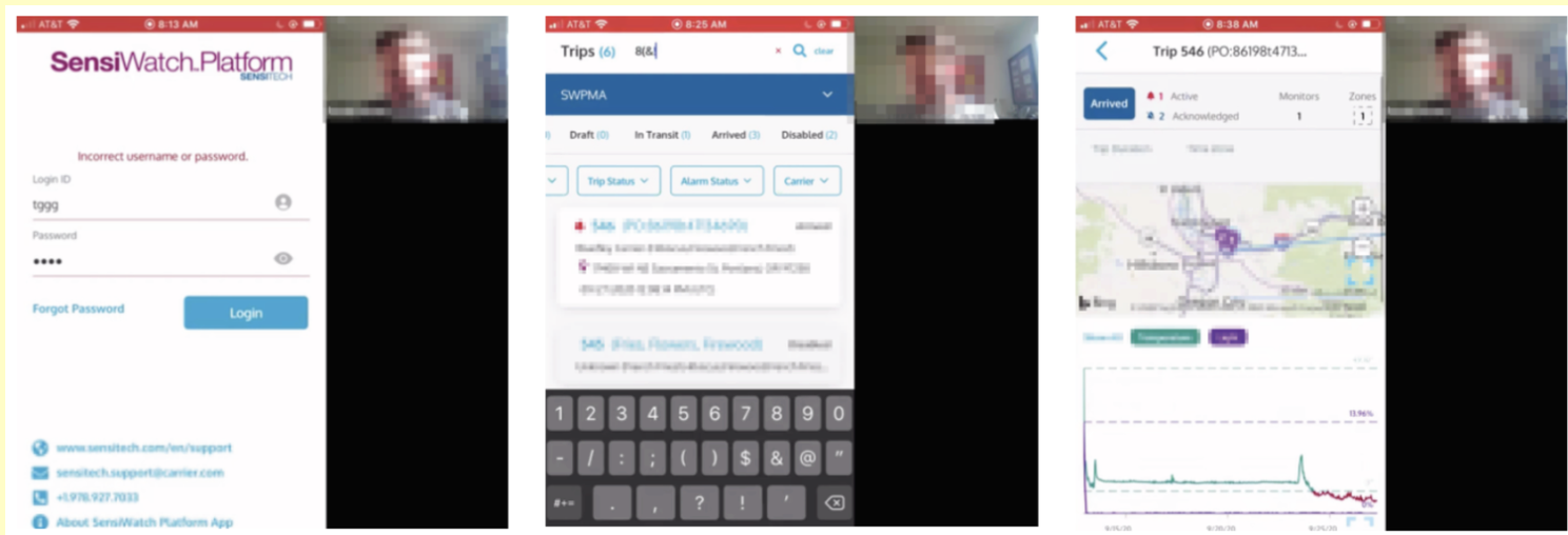
The SensiWatch Platform mobile app lets logistics teams track shipments in transit, monitor temperature and condition alarms, and manage trip data from a phone. The team suspected users were struggling with parts of the app but didn't know exactly where or why. I designed and ran a structured usability study to find out, and to turn general concern into specific, actionable findings.
My role
I owned the research end to end: designing the task scenarios, recruiting and screening participants, moderating each remote session, and synthesizing the findings into recommendations the product team could act on. Every recommendation was tied back to a specific, observed moment in a session rather than a general impression of the app.
The problem
{{ item }}
Key decisions in the research
The goal was findings the team could act on, not just a list of complaints.
Designed realistic task-based scenarios
I created task flows covering login, navigation, trip details, alarms, and maps, the core things a logistics user actually does in the app, so findings would be grounded in real usage rather than an artificial walkthrough.
Facilitated moderated remote sessions
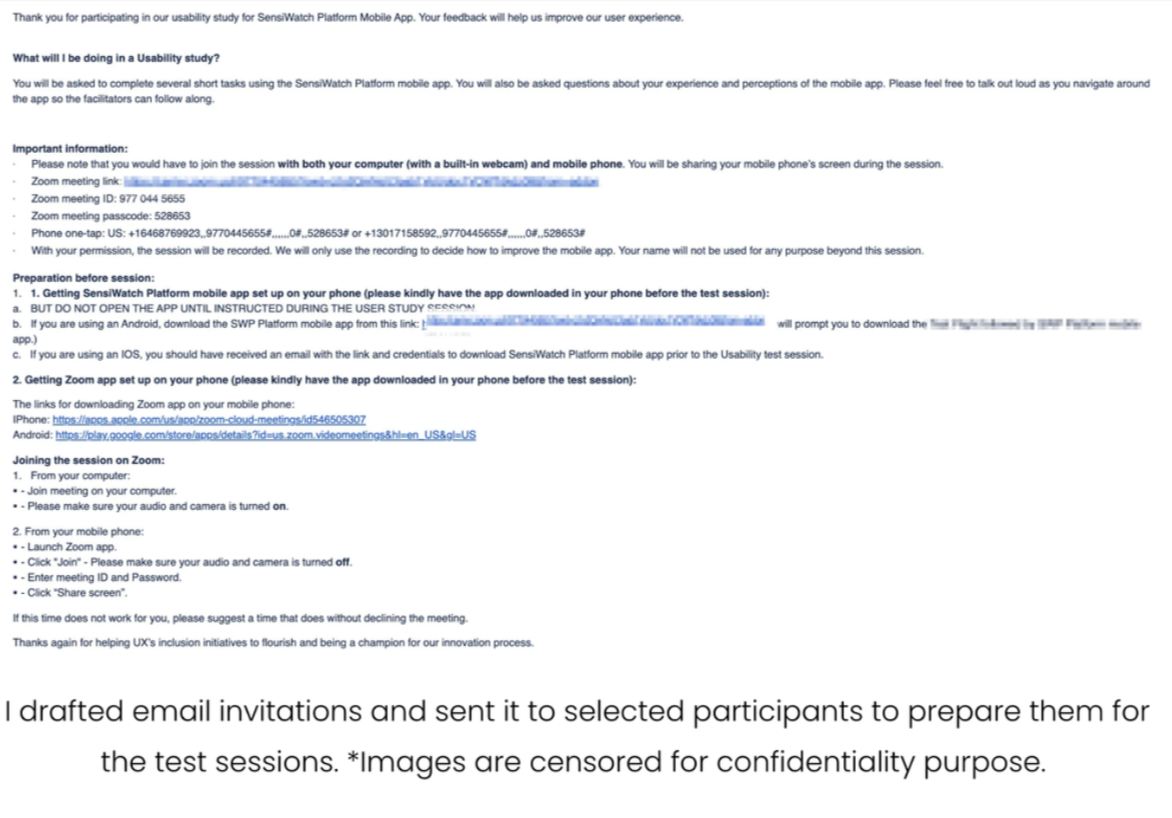
Each one-hour session had participants share their phone screen live while talking through their thought process out loud, which surfaced hesitations and wrong turns that a survey or a recording alone would have missed.
Combined qualitative and quantitative analysis
Alongside behavioral observations and direct quotes, I tracked success rates for specific tasks, for example, the share of participants who struggled with a given feature, so the findings carried weight beyond any one person's experience.
Identified and prioritized usability issues
I synthesized session observations into recurring themes and ranked them by how often they came up and how much friction they caused, so the team knew what to fix first rather than facing an undifferentiated list.
Translated insights into actionable design improvements
Each finding came with a concrete recommendation, improving login recovery, redesigning the filter interaction, clarifying status indicators, so the research handed the product team a starting point for the fix, not just a description of the problem.
What the sessions revealed
{{ f.title }}
{{ f.body }}
- {{ pt }}
{{ f.opportunity }}
What made running this study hard
{{ c.title }}
{{ c.body }}
Where it landed
The study gave the product team a prioritized, evidence-backed list of usability problems, ranked by how many participants hit them and how much friction they caused, in place of a general sense that the app could be better.
Recommendations like improving login recovery, redesigning the filter interaction, and clarifying status indicators fed directly into the next round of design updates.