❋
Improving Mobile Product Usability Through Structured User Research
Intro
The SensiWatch mobile app supports users in monitoring shipments and managing critical logistics data, but key workflows lacked clarity and consistency, impacting usability.
This project focused on designing and leading a structured usability research initiative to uncover friction points, evaluate core workflows, and identify opportunities to improve usability and overall user experience.
My role
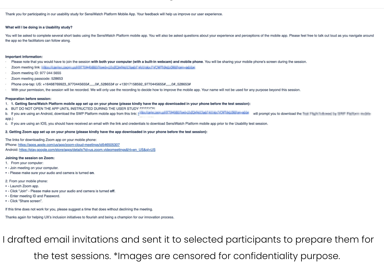
I led the usability research effort end-to-end, defining the study design, creating task scenarios, and facilitating remote testing sessions.
I worked closely with product managers and engineers to align on research goals and ensure findings were actionable.
Beyond running sessions, I developed a structured approach to capturing both qualitative and quantitative insights, mapping user paths, and identifying patterns to prioritize improvements.
❋ Lack of visibility into real user behaviorExisting assumptions about usability were not validated, making it difficult to identify where users were actually struggling.
❋ Users adapting to poor UXParticipants had developed workarounds, masking underlying usability issues that only surfaced through observation.
❋ Capturing both qualitative and quantitative insightsBuilding a business case involves multiple paths (new vs existing customer, different products, different value drivers), making it difficult to create a clear and guided flow.
❋ Ensuring realistic testing conditionsDesigning scenarios that reflected real-world usage was critical to uncover meaningful usability issues.
Designed and executed a structured usability testing framework to uncover actionable insights and drive product improvements.
Challenges
Solution

❋ Missing system feedback created confusionUsers struggled when the system did not clearly communicate outcomes or states.
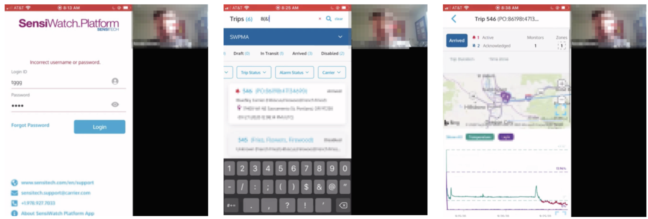
80% couldn’t recover login ID
unclear error messaging (username vs password)
“arrived” status looked like an action button
Opportunity
Improve system feedback and messaging to make outcomes and next steps clear
❋ Hidden or inaccessible functionalityUsers had difficulty discovering or accessing key features.
difficulty locating expand feature
missed back navigation
issues editing/deleting acknowledgments
Opportunity
Surface important actions more clearly and reduce reliance on hidden controls
Research findings
❋ Interaction patterns didn’t match expectationsUsers expected familiar mobile behaviors, but interactions were inconsistent or unintuitive.
80% struggled to exit filter (expected tap outside)
users tried to uncheck filters instead of using “clear”
confusion around red X vs clear in search
Opportunity
Align interactions with common mobile patterns and make actions more predictable
❋ Missing system feedback created confusionSome UI elements did not clearly communicate what they were or how to use them.
disabled trips unclear (60%)
expand icon on map not visible
icons too small / too close together
Opportunity
Improve visual clarity, spacing, and affordance to make interactions more obvious
Key decisions in the experience
Designed realistic task-based scenarios
Created task flows (login, navigation, trip details, alarms, maps) that reflected real user behavior, ensuring findings were grounded in actual usage.
Facilitated moderated remote sessions
Conducted one-hour sessions where participants shared their screens and verbalized their thought process, allowing deeper insight into user behavior.
Combined qualitative and quantitative analysis
Captured behavioral patterns, user quotes, and success rates (e.g. % of users struggling with specific features) to strengthen findings.
Identified and prioritized usability issues
Synthesized observations into recurring themes and ranked issues based on frequency and impact.
Translated insights into actionable design improvements
Delivered clear recommendations (e.g. improving login recovery, redesigning filters, clarifying status indicators) that directly informed product updates.
The research uncovered critical usability gaps across key workflows, including navigation, filtering, and system feedback.
These insights informed targeted design improvements, reducing user confusion and improving task efficiency.
It also established a more structured approach to usability testing within the team, enabling future research to be more scalable and actionable.
Impact
Overall, users were able to complete core tasks and found value in the app, but several interaction patterns created unnecessary friction and confusion.
Most issues were not blockers, but they slowed users down and required workarounds — indicating opportunities to improve clarity, feedback, and interaction consistency.