❋
Designing a Centralized Onboarding Hub for Financial Products
Intro
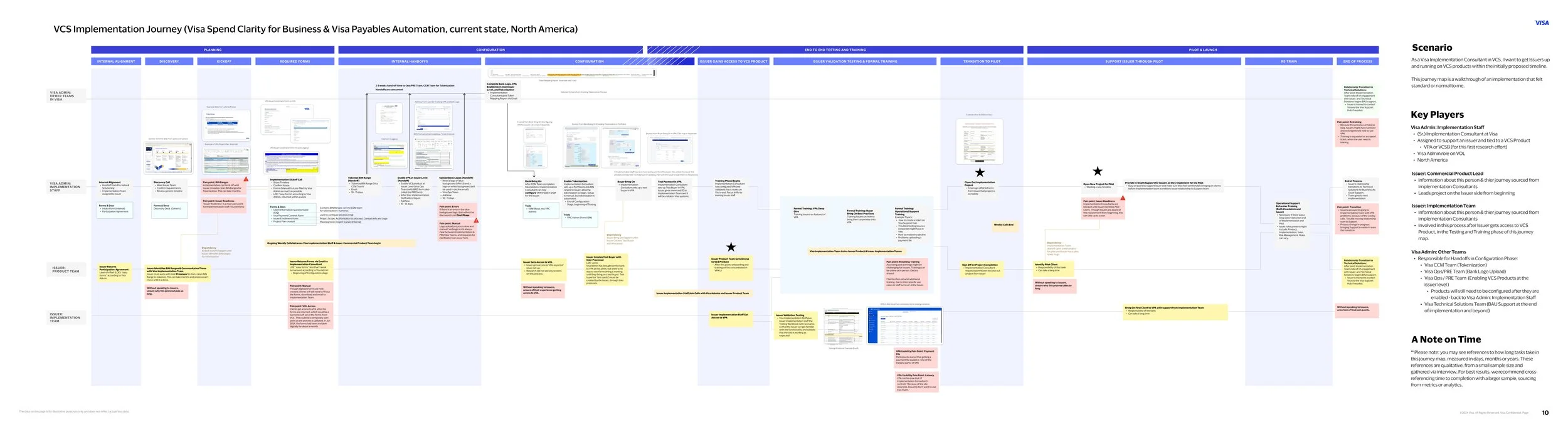
Issuer onboarding at Visa was a highly manual, fragmented process driven by Excel forms, PDFs, and back-and-forth communication between issuers and internal teams.
This project focused on transforming that process into a centralized, scalable web-based onboarding experience, reducing operational friction, improving data accuracy, and creating a more transparent experience for both issuers and internal stakeholders.
My role
As the lead UX designer, I owned the end-to-end design of the onboarding experience.
I facilitated cross-functional workshops with product stakeholders to align on problem definition, mapped complex data structures across multiple legacy forms, and partnered closely with UX research to validate assumptions and test solutions.
I also worked alongside engineering and product to ensure the solution was scalable and aligned with technical constraints.
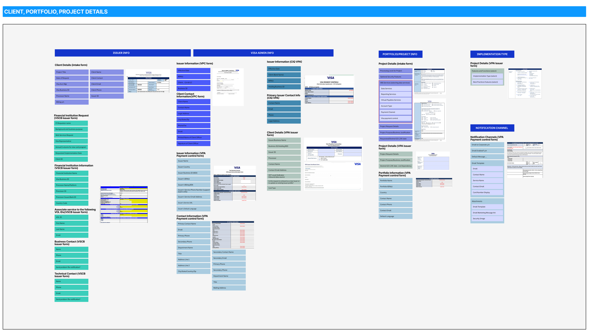
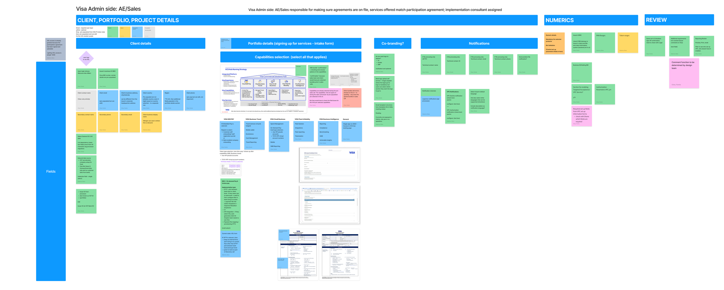
❋ Fragmented and manual onboarding processOnboarding was spread across Excel sheets, PDFs, and disconnected forms owned by different teams, leading to duplicated data entry and no single source of truth.
❋ High operational friction and back-and-forthIncomplete or incorrect submissions resulted in repeated communication between issuers and internal teams, slowing down onboarding and increasing effort on both sides.
❋ Complex data relationships hidden in flat formsCritical relationships between entities (e.g. issuer, business IDs, contacts) were embedded in static documents, making dependencies unclear and increasing the risk of errors.
❋ Lack of structure, visibility, and scalabilityThe process lacked a clear flow, progress tracking, and system feedback, making it difficult for users to understand what was required and for teams to scale or evolve the experience.
Instead of digitizing existing forms, I restructured onboarding as a system.
I mapped and consolidated data across multiple legacy forms into a unified data model, identifying redundancies and redefining how information should be structured and collected.
This allowed us to move from a fragmented, document-based process to a structured, web-based onboarding experience.
Challenges

Reframing the Problem as a System

Key decisions in the experience
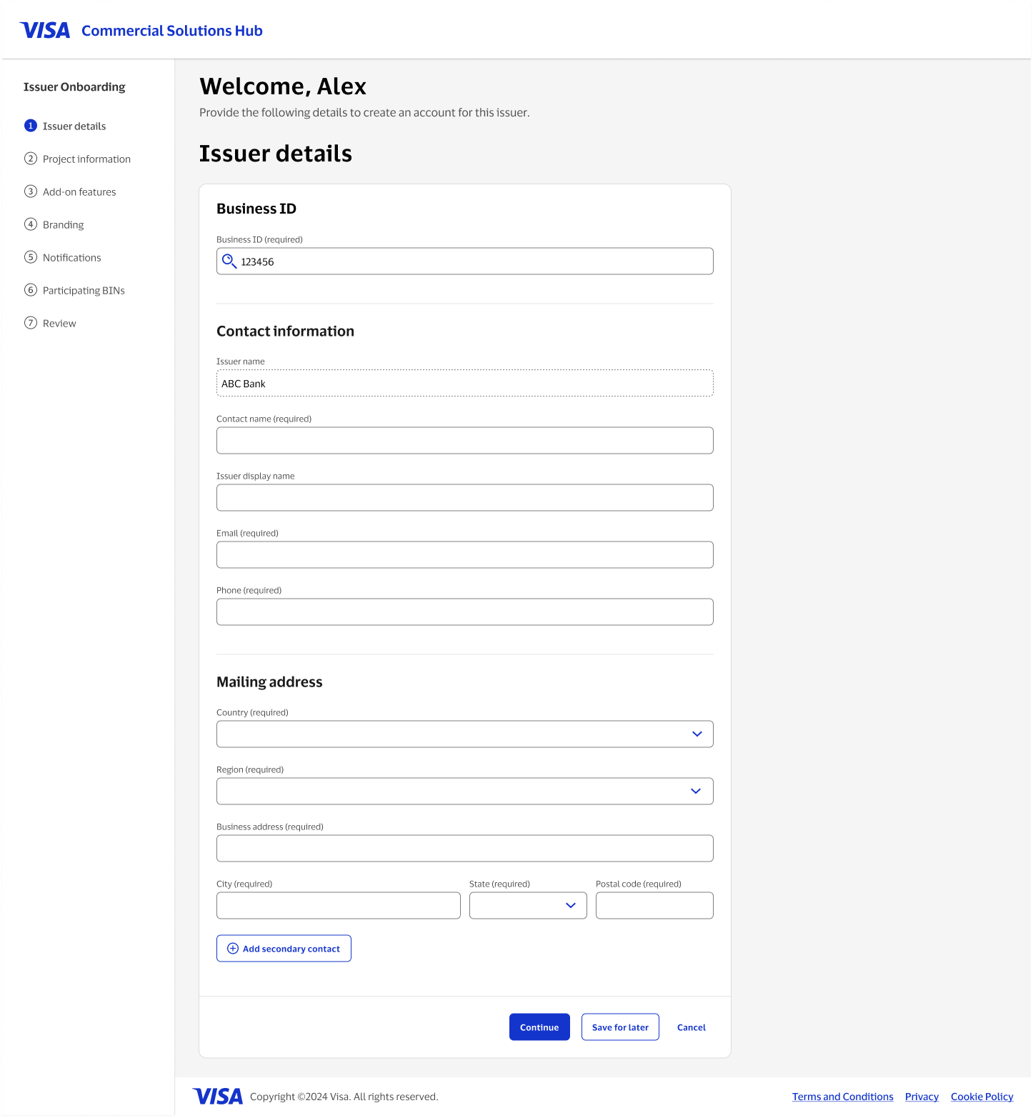
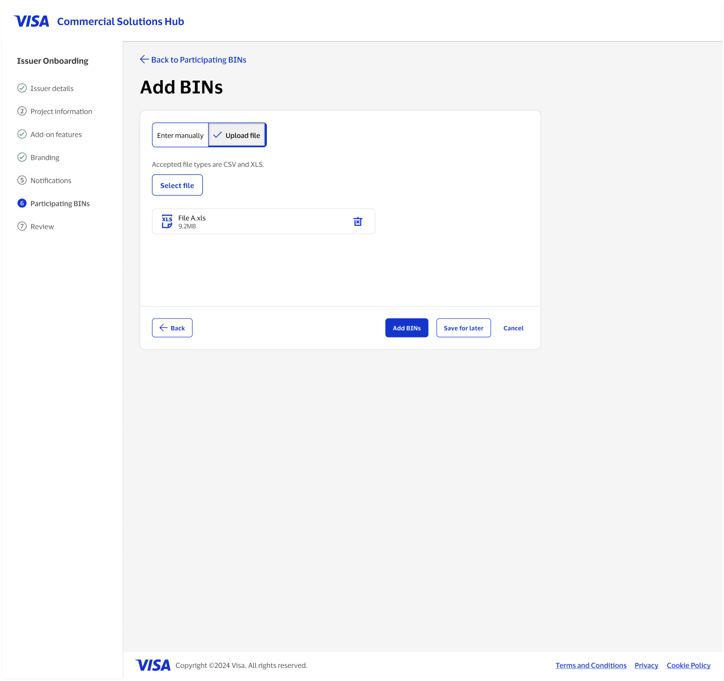
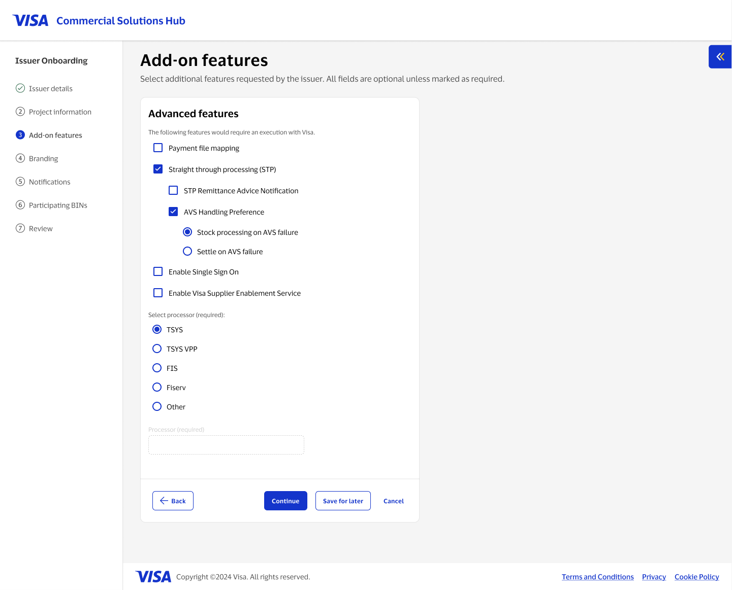
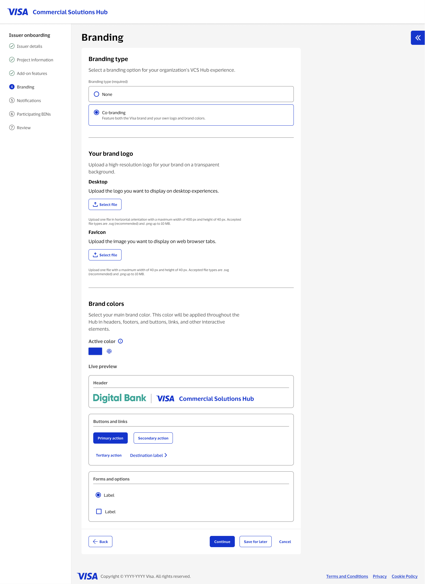
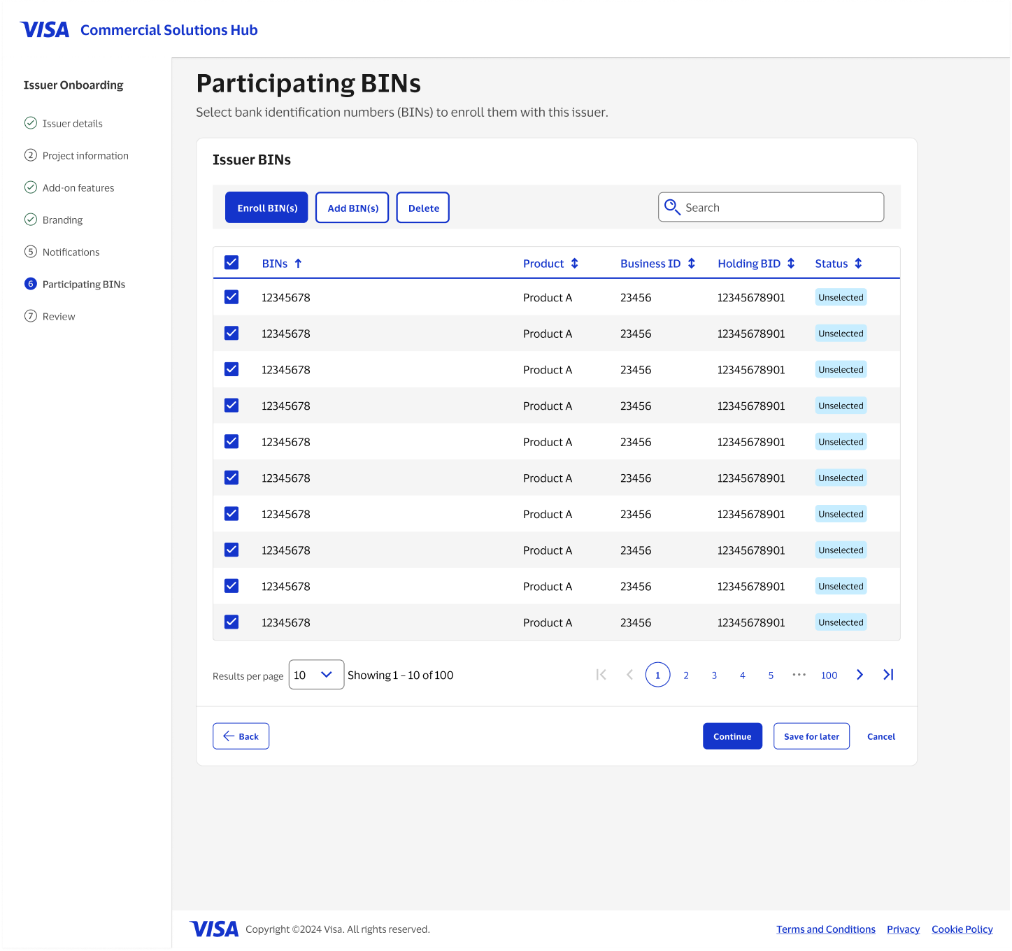
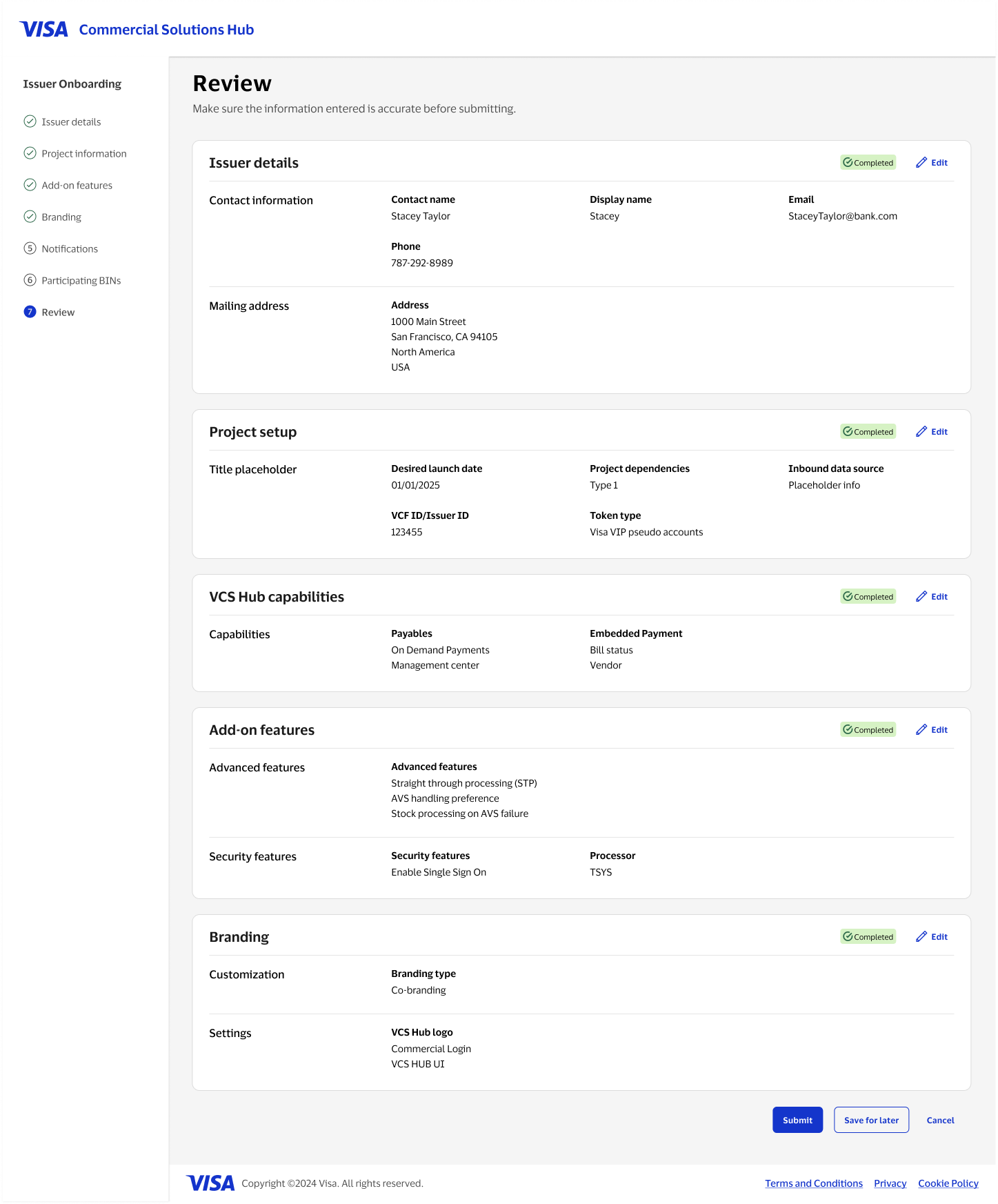
Breaking onboarding into steps
Instead of one long, overwhelming form, I broke the process into a series of clear steps. This made it easier for users to focus on one thing at a time and understand where they were in the flow.
Reorganizing how data is captured
The original forms were structured around internal documents, not how users think. I regrouped fields based on logical relationships (e.g. business info, contacts, IDs), which reduced duplication and made the flow feel more intuitive.
Reducing repetitive input
A lot of the same information was being entered multiple times. I introduced pre-fill where possible and added validation early, so users could catch mistakes before moving forward.
Making progress and status visible
Previously, users had no sense of where they were or what was left. I added a stepper, clearer sectioning, and save-for-later so they could move through the process with more confidence and flexibility.
The new onboarding experience reduced manual effort, minimized back-and-forth communication, and created a scalable foundation for future onboarding flows across products.
It also improved data quality and provided greater transparency for both issuers and internal teams.